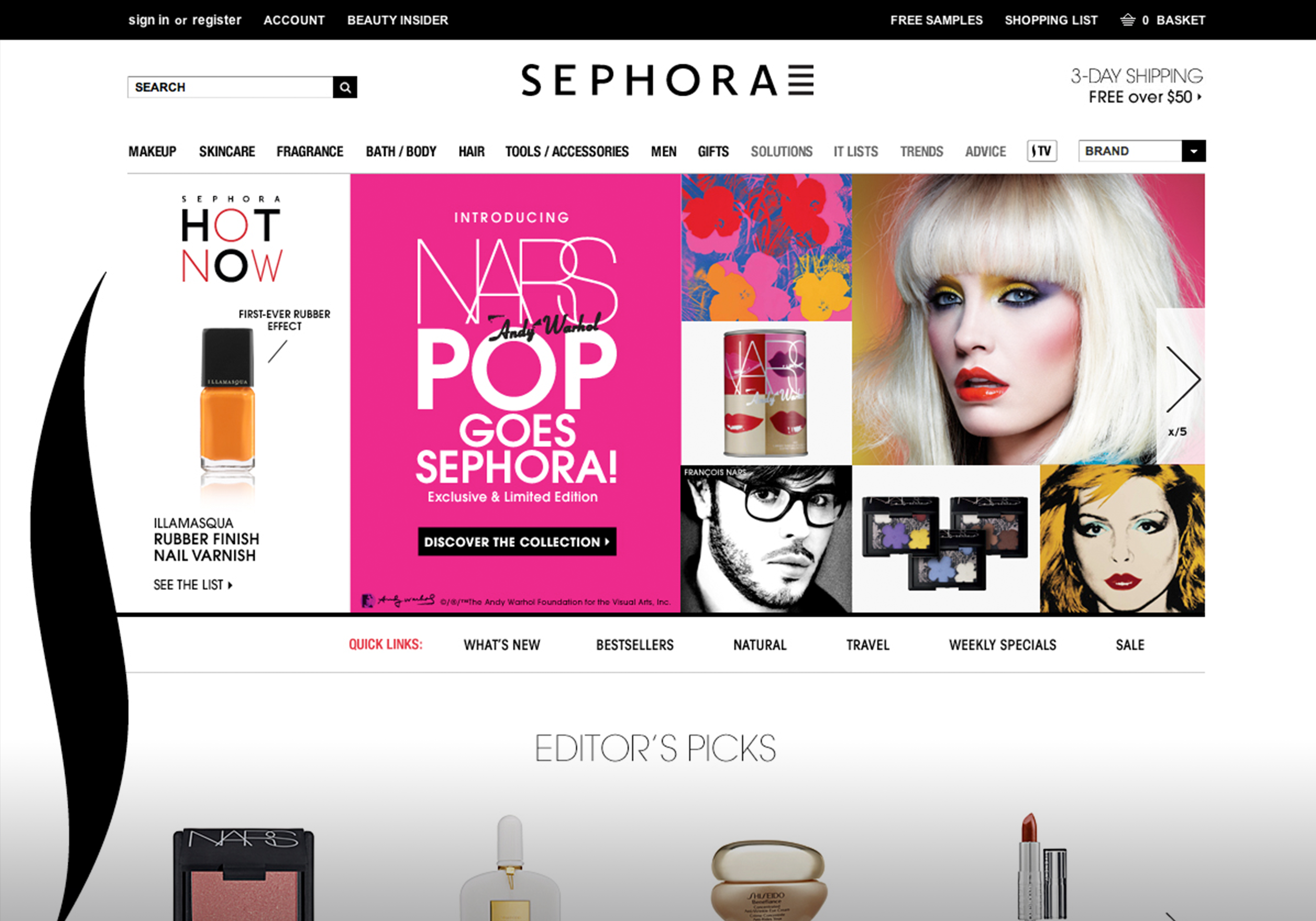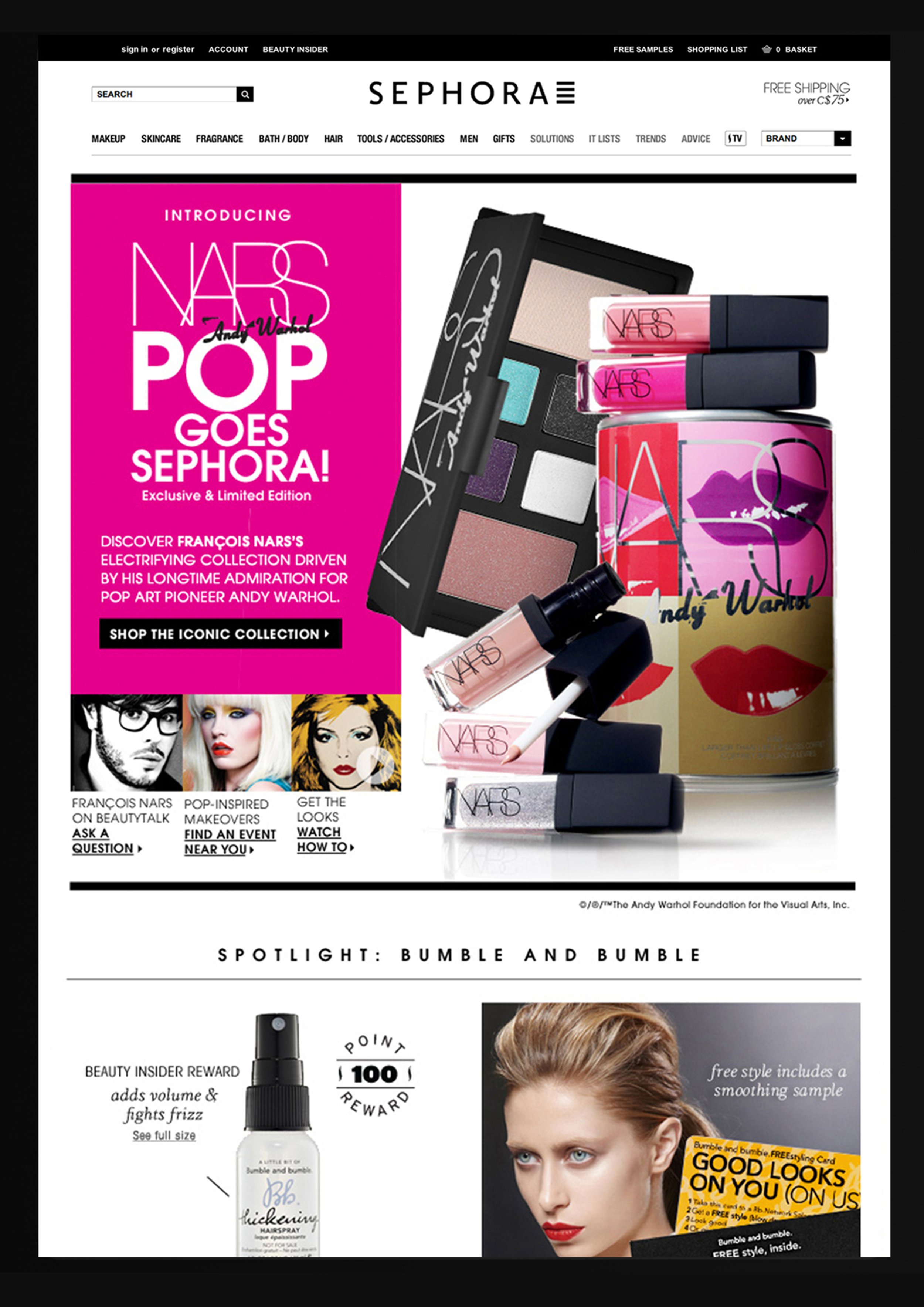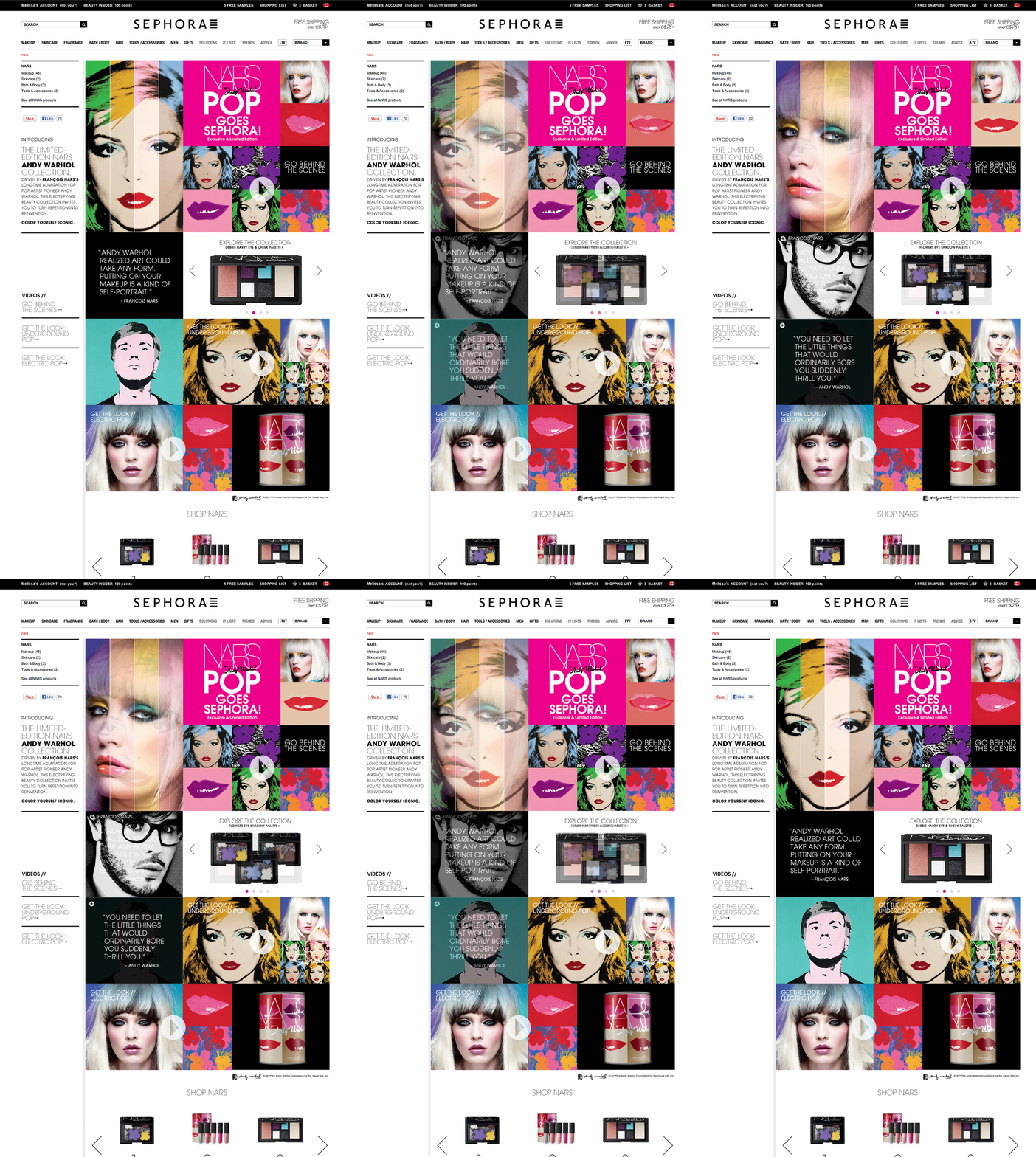
Sephora
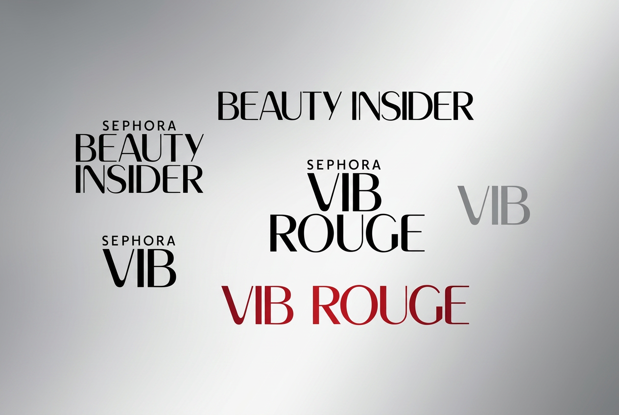
Beauty Insider membership program Rebranding
People leadership (team of 3) · Campaign + email · Loyalty program design system
Context: Sephora carries 300+ prestige beauty brands under one roof — its business advantage depends on customers seeing Sephora itself, not just the products on its shelves, as the destination worth returning to. The Beauty Insider loyalty program is the mechanism that turns one-time shoppers into repeat, higher-spending members, so it needed to feel like one seamless experience across physical and digital touchpoints.
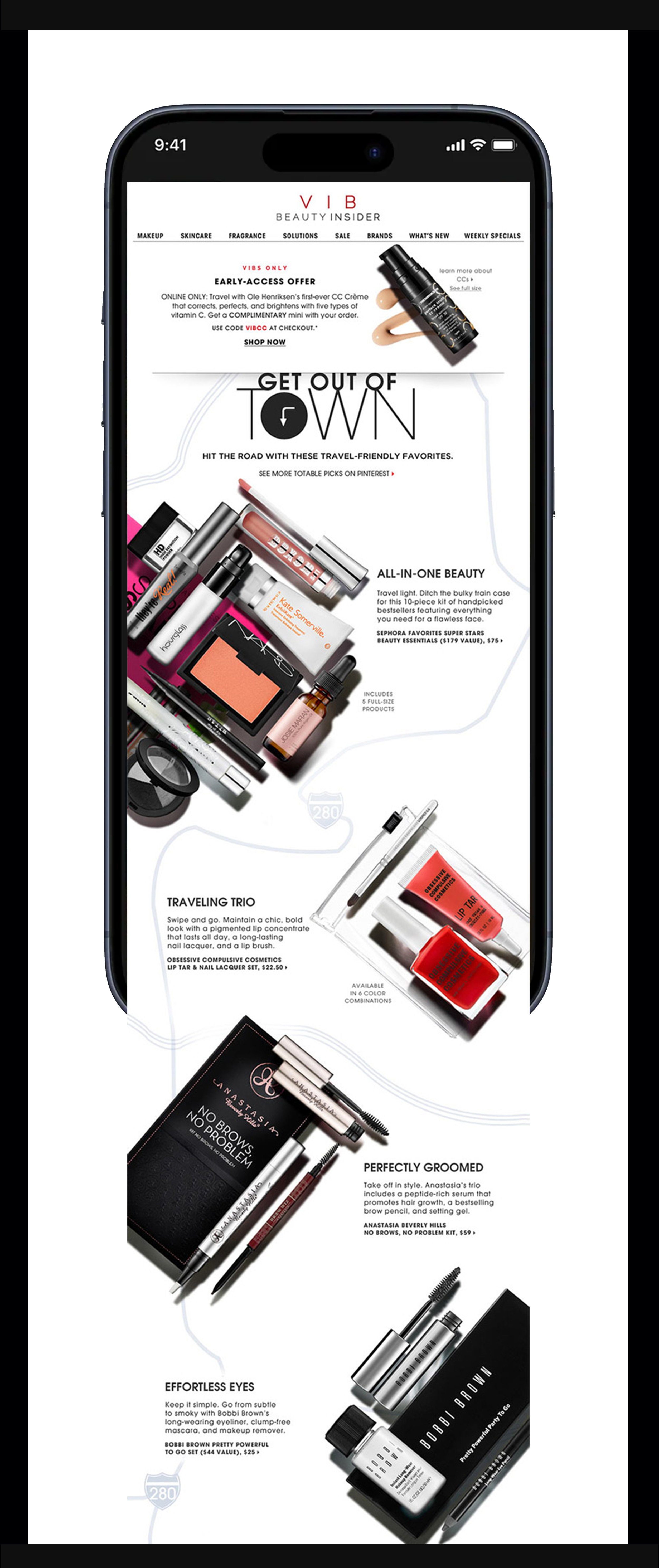
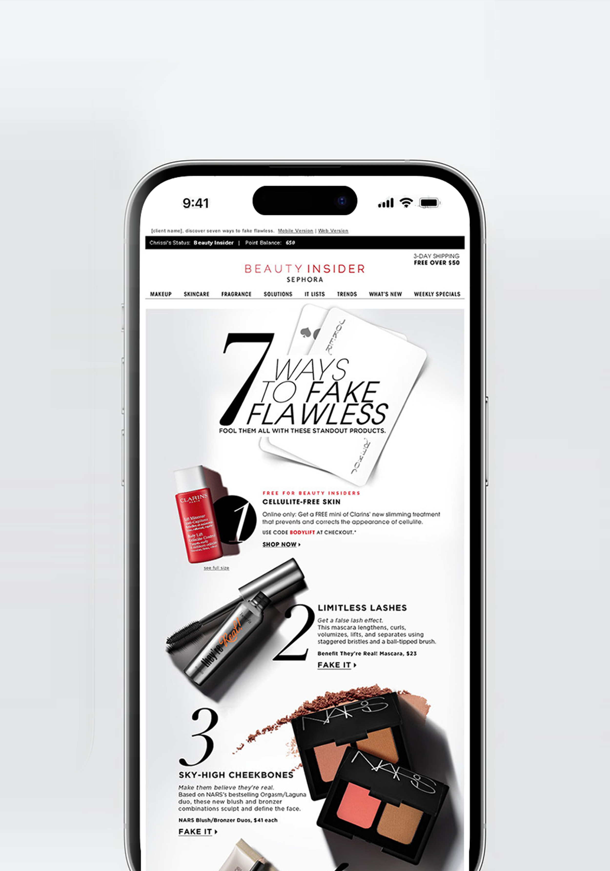
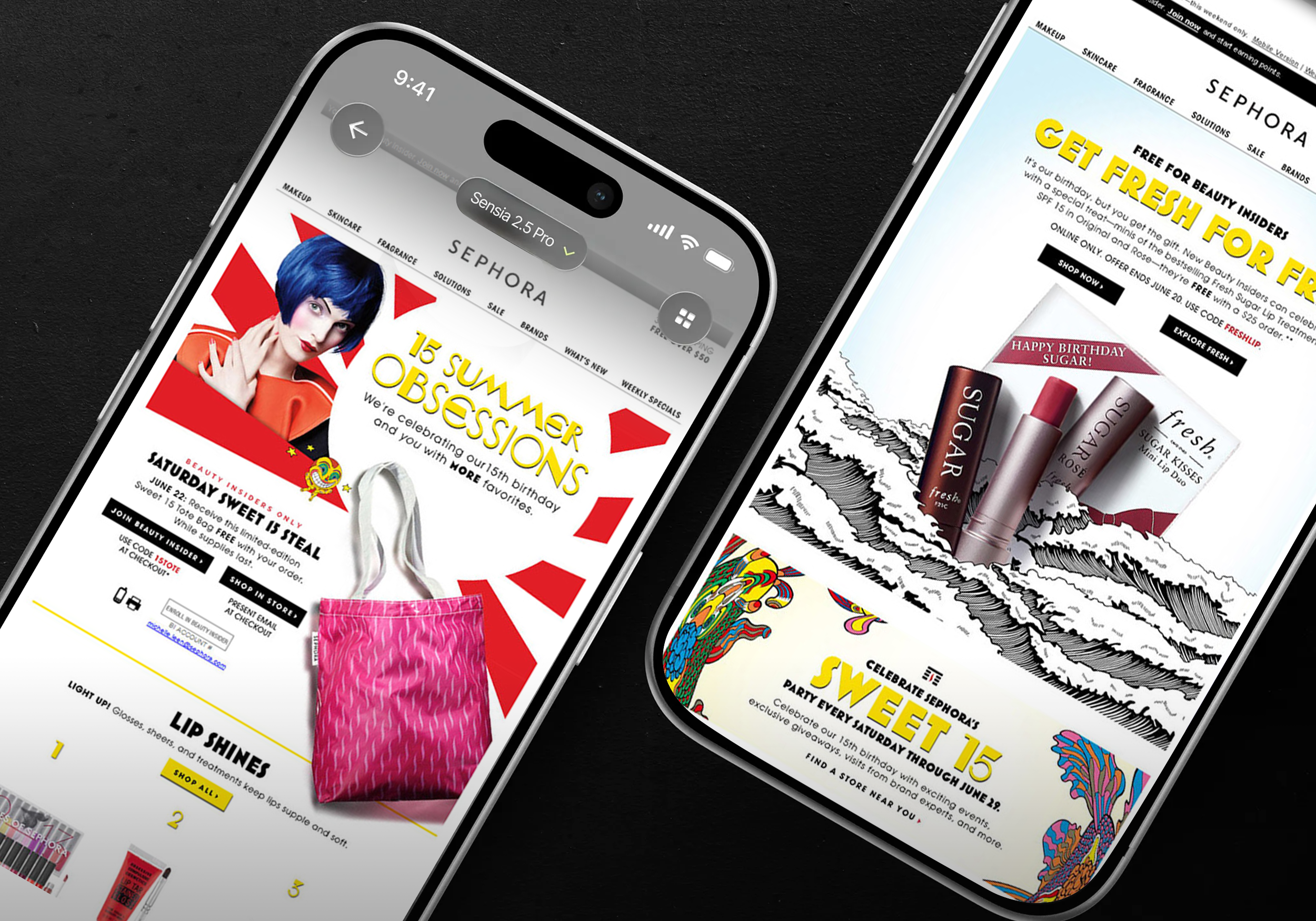
Challenge: The existing program’s lack of a clear visual hierarchy created two problems at once: a business problem (members couldn’t see the next tier clearly enough to be motivated to spend toward it) and an audience problem (across hundreds of competing brands and messages, members had no fast way to recognize their own status and benefits).
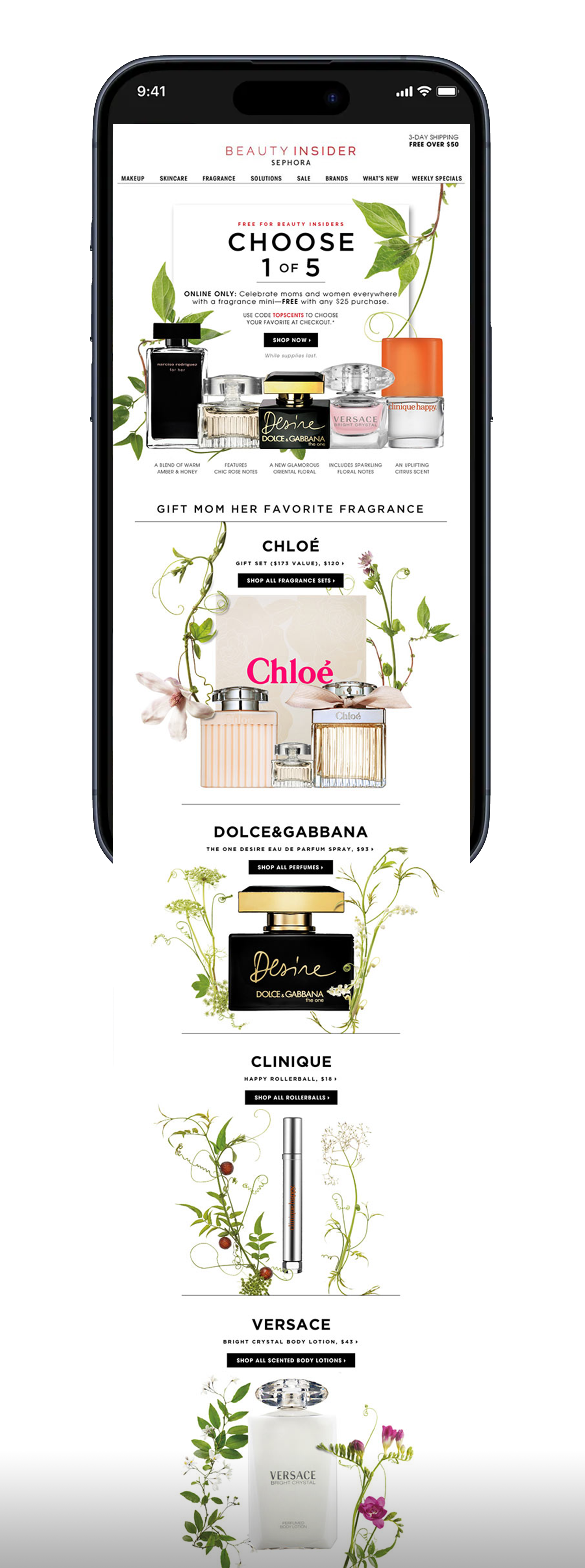
My Role: I led a newly formed three-person design team — managing workload, mentoring designers, and setting the visual direction for campaigns and email.
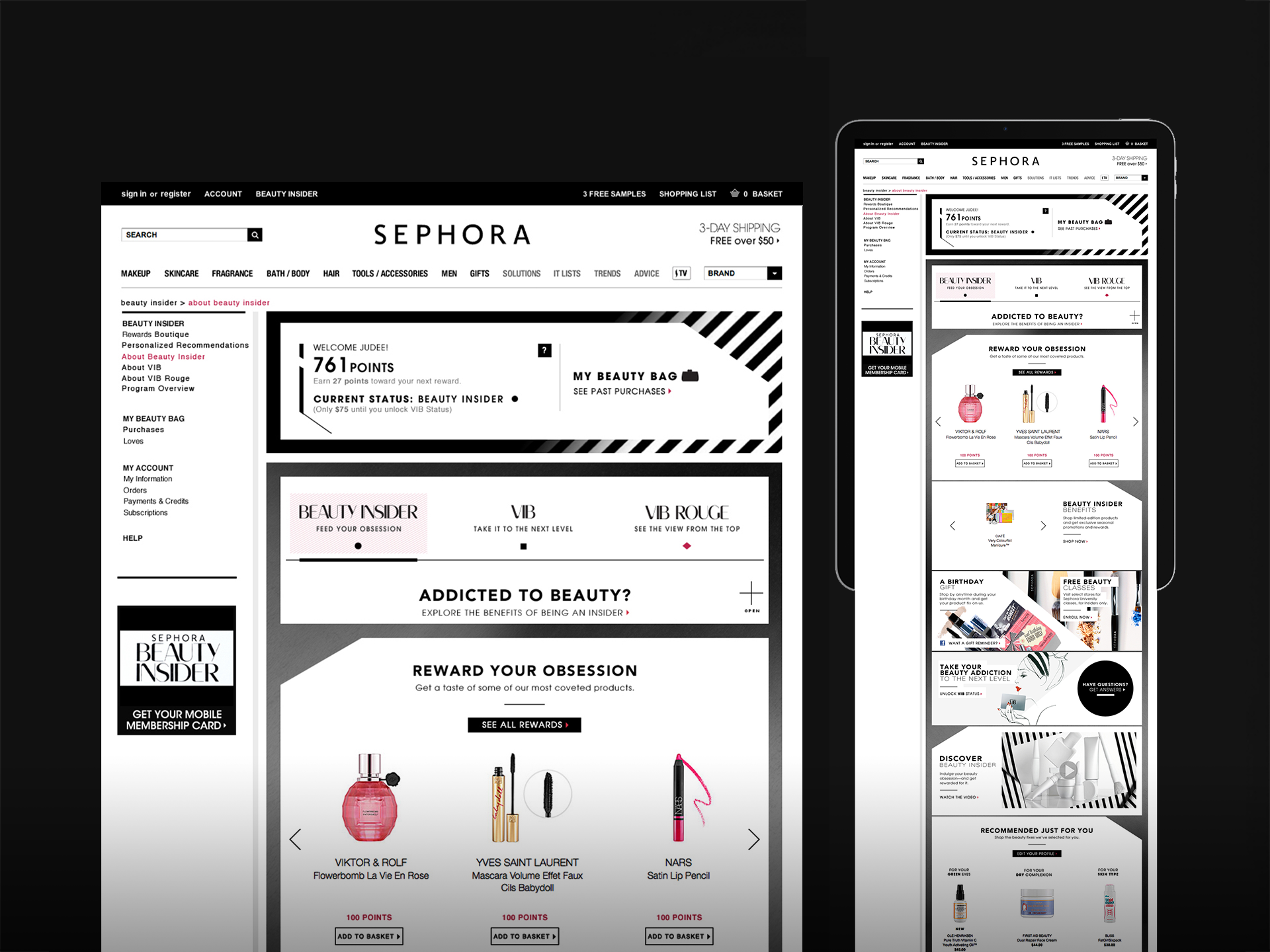
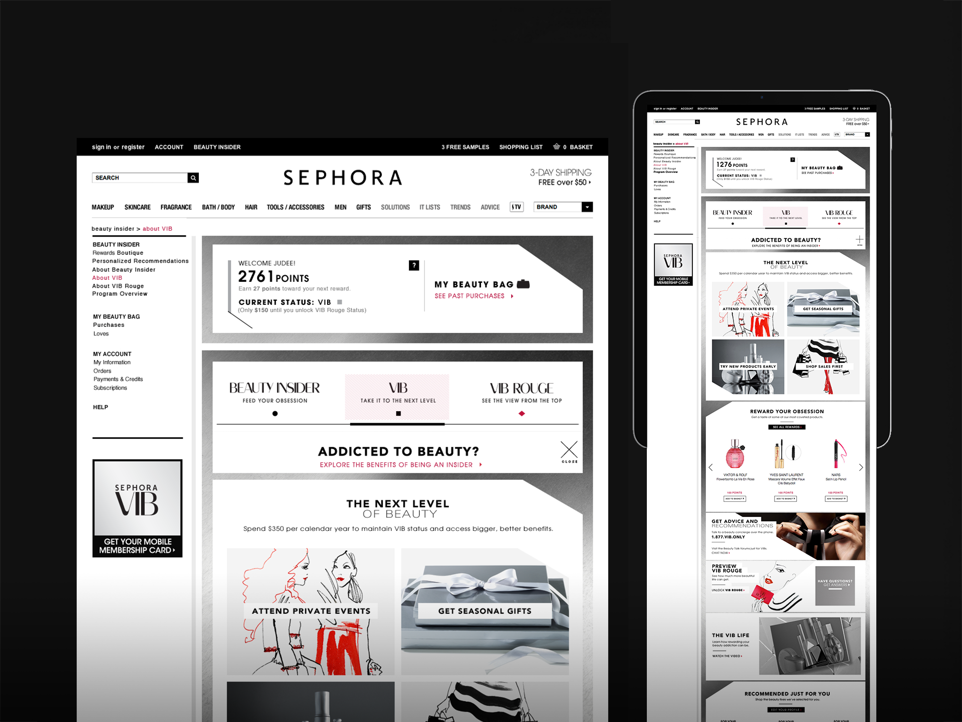
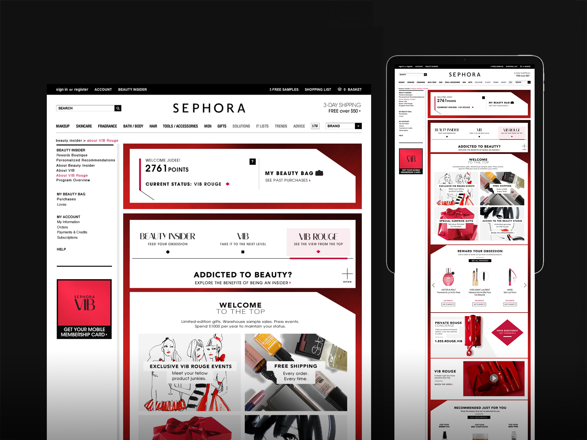
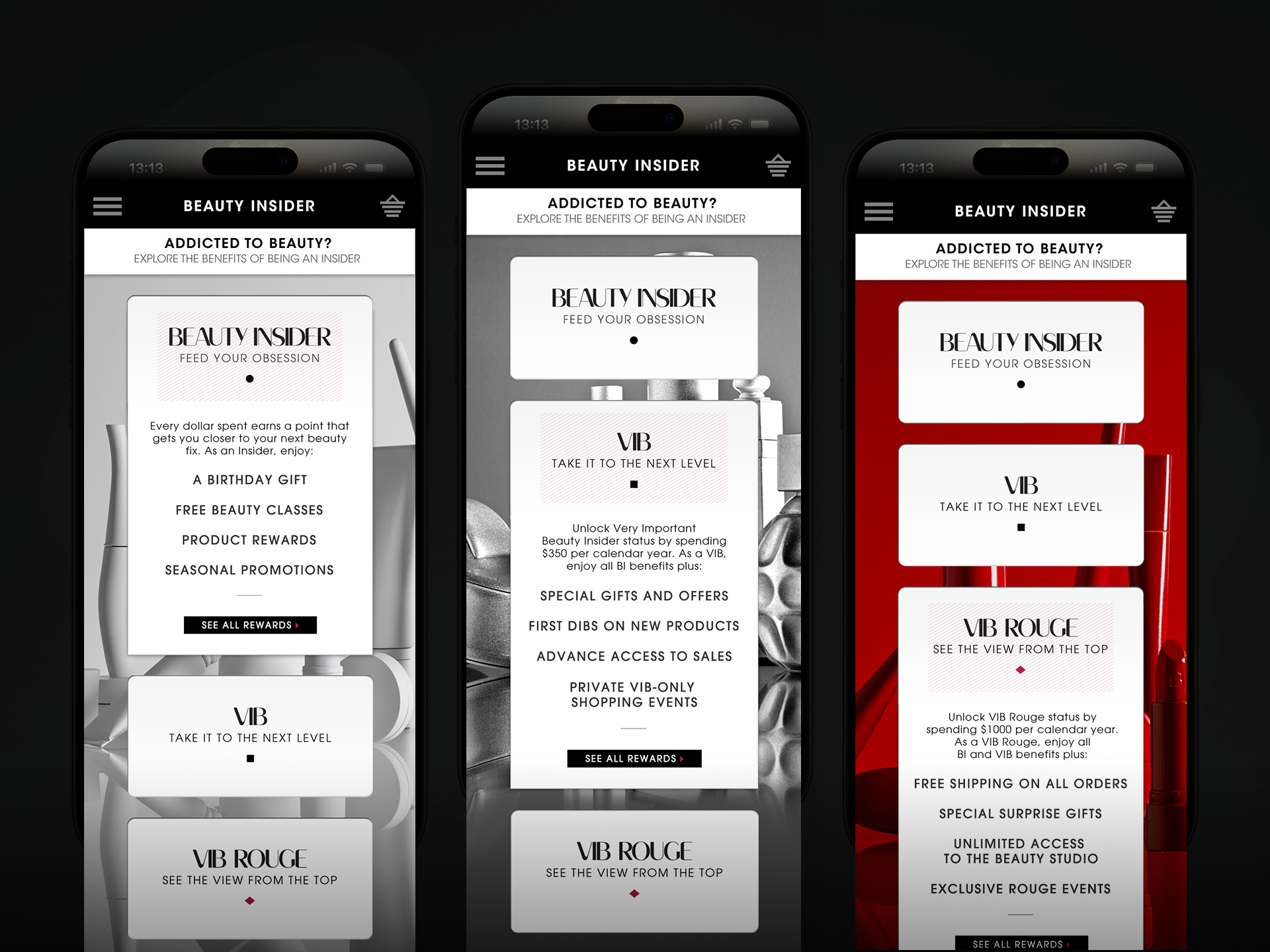
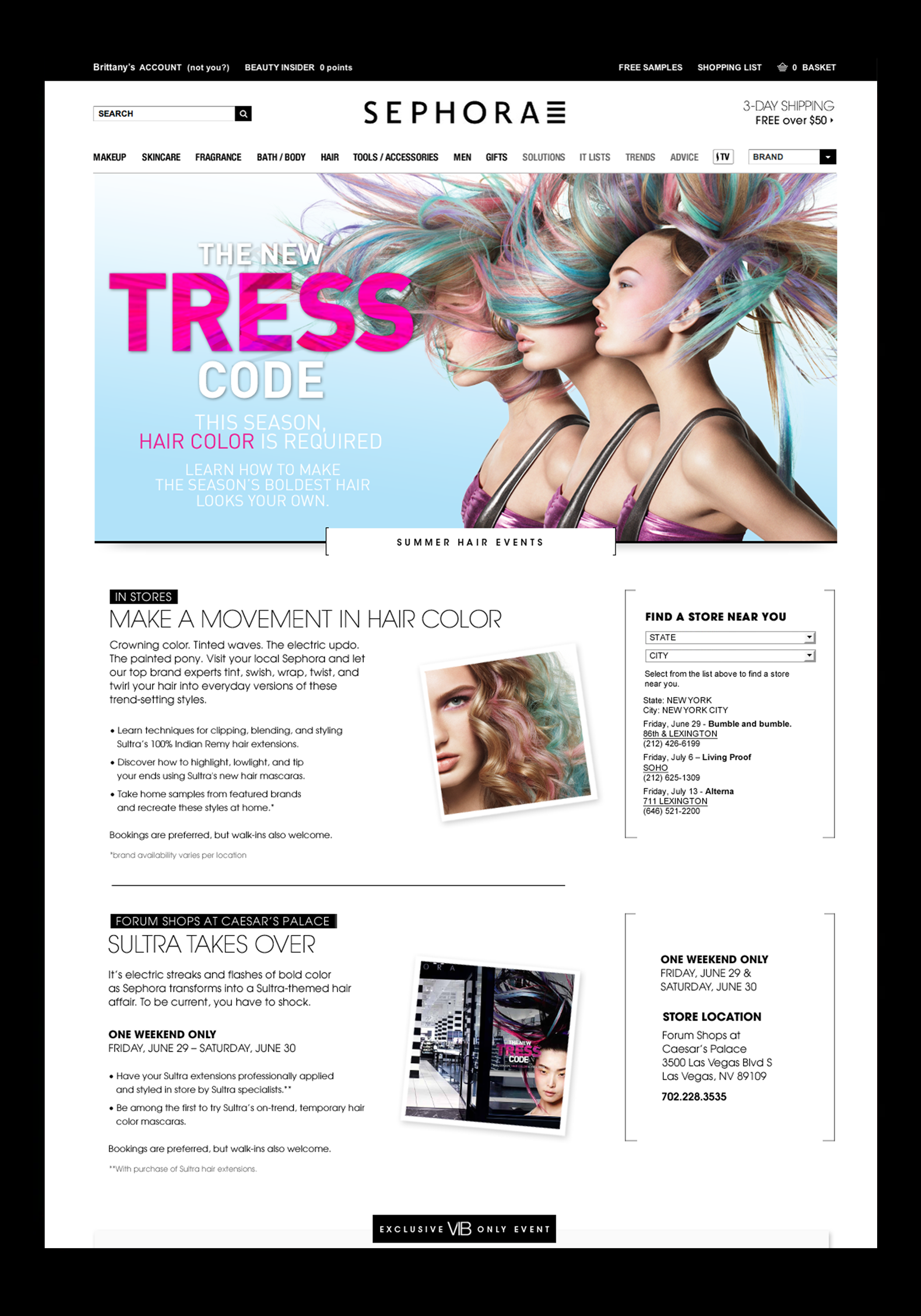
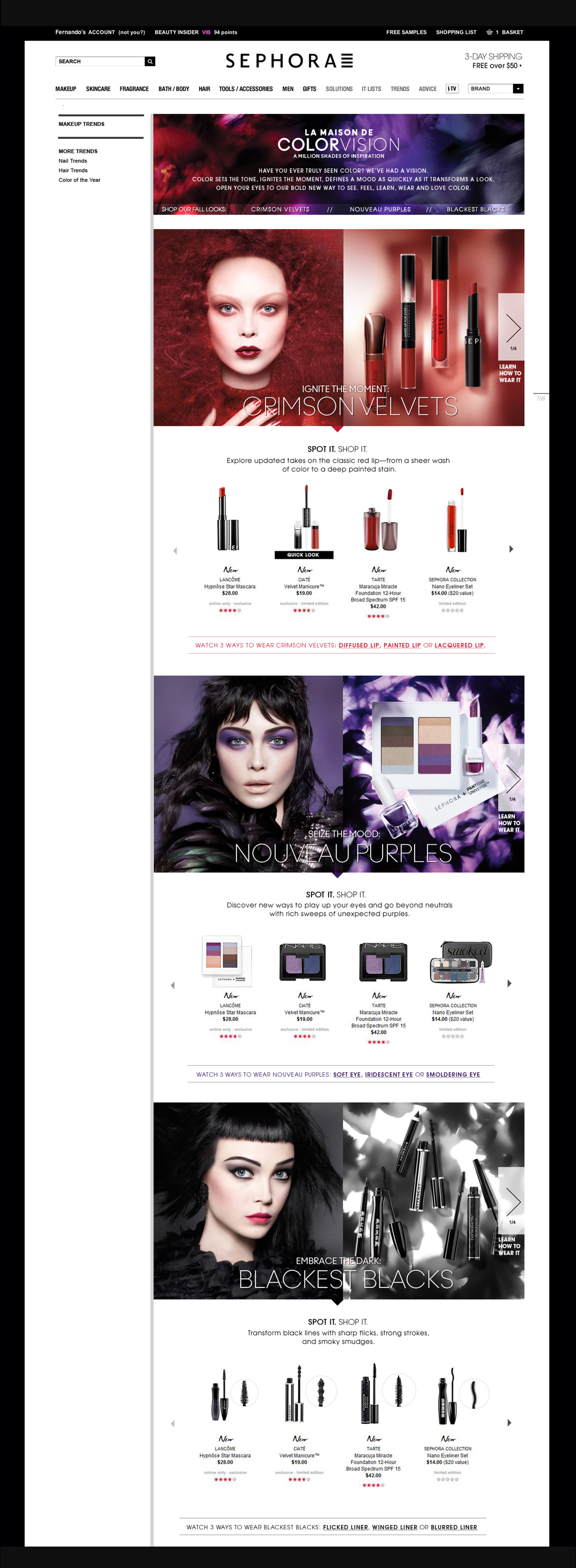
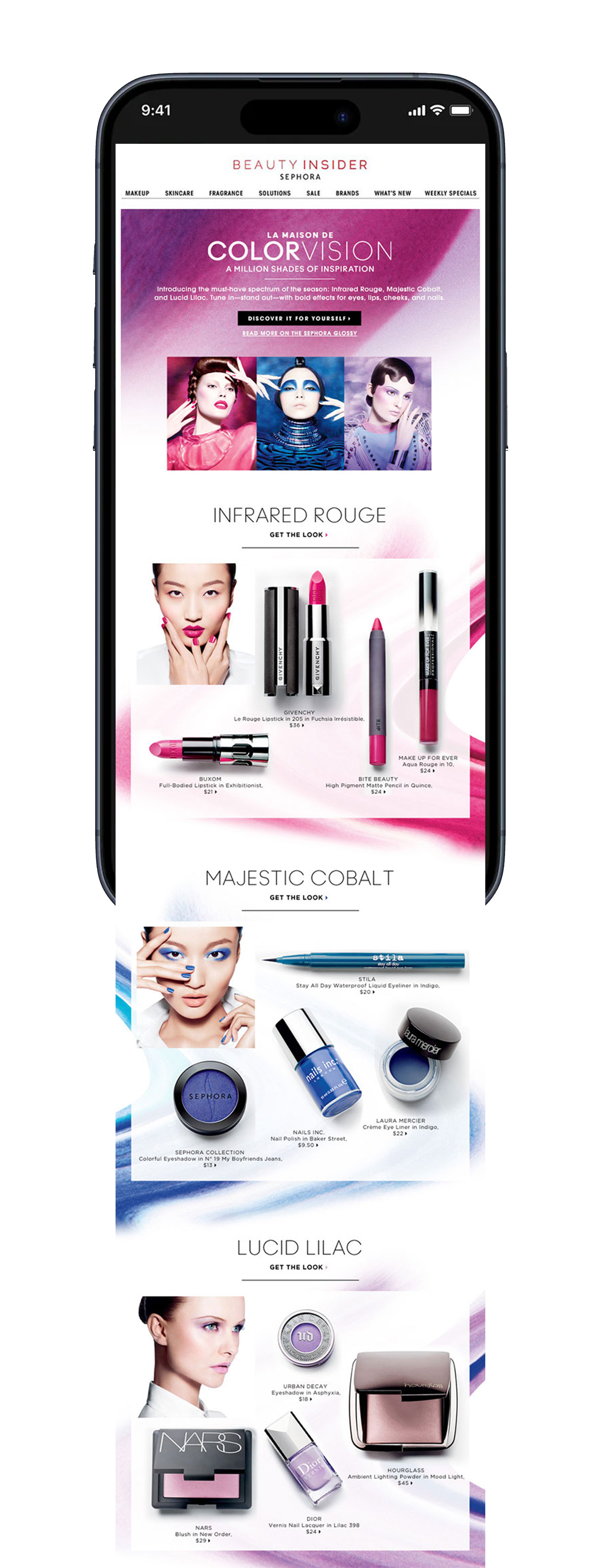
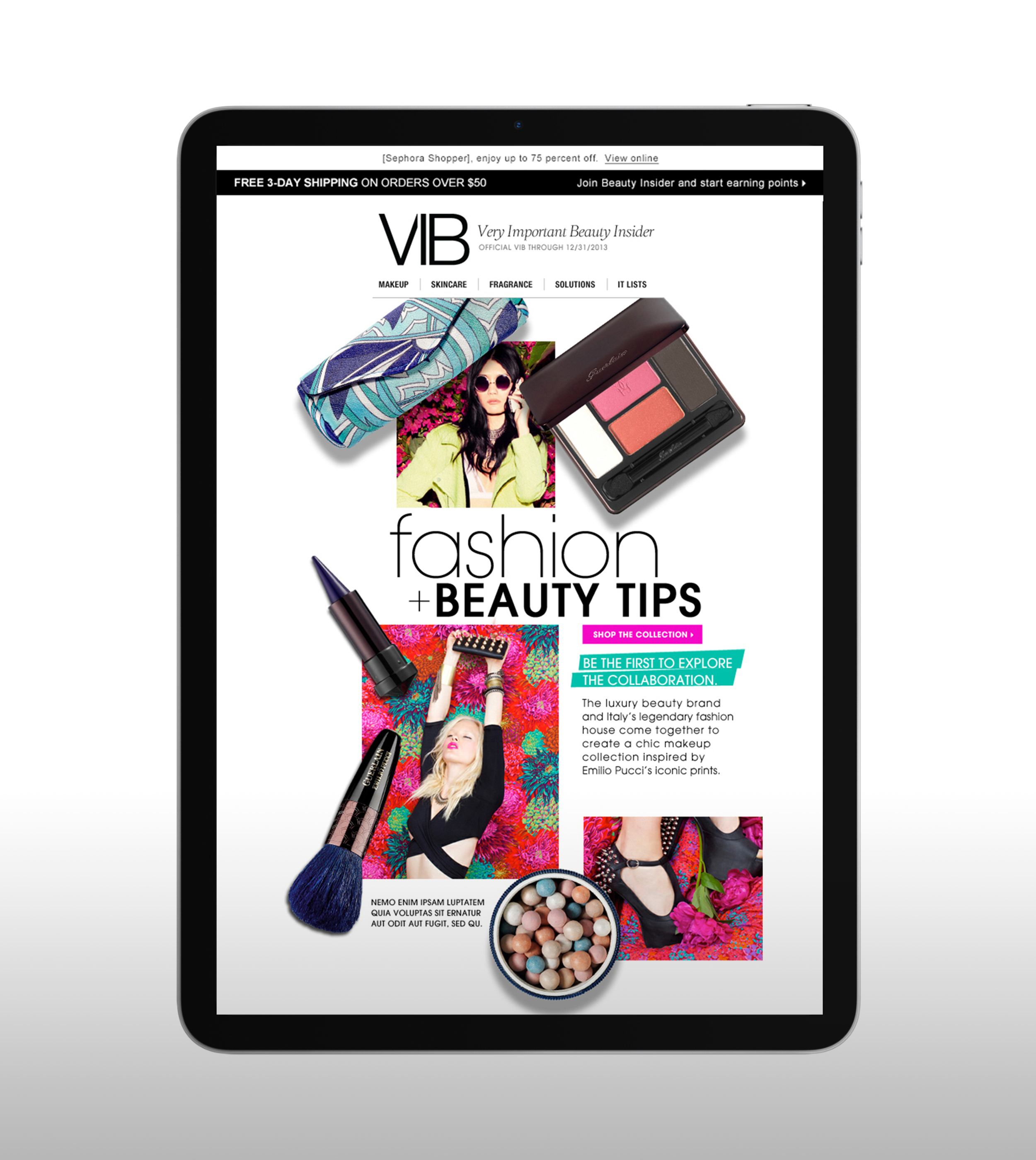
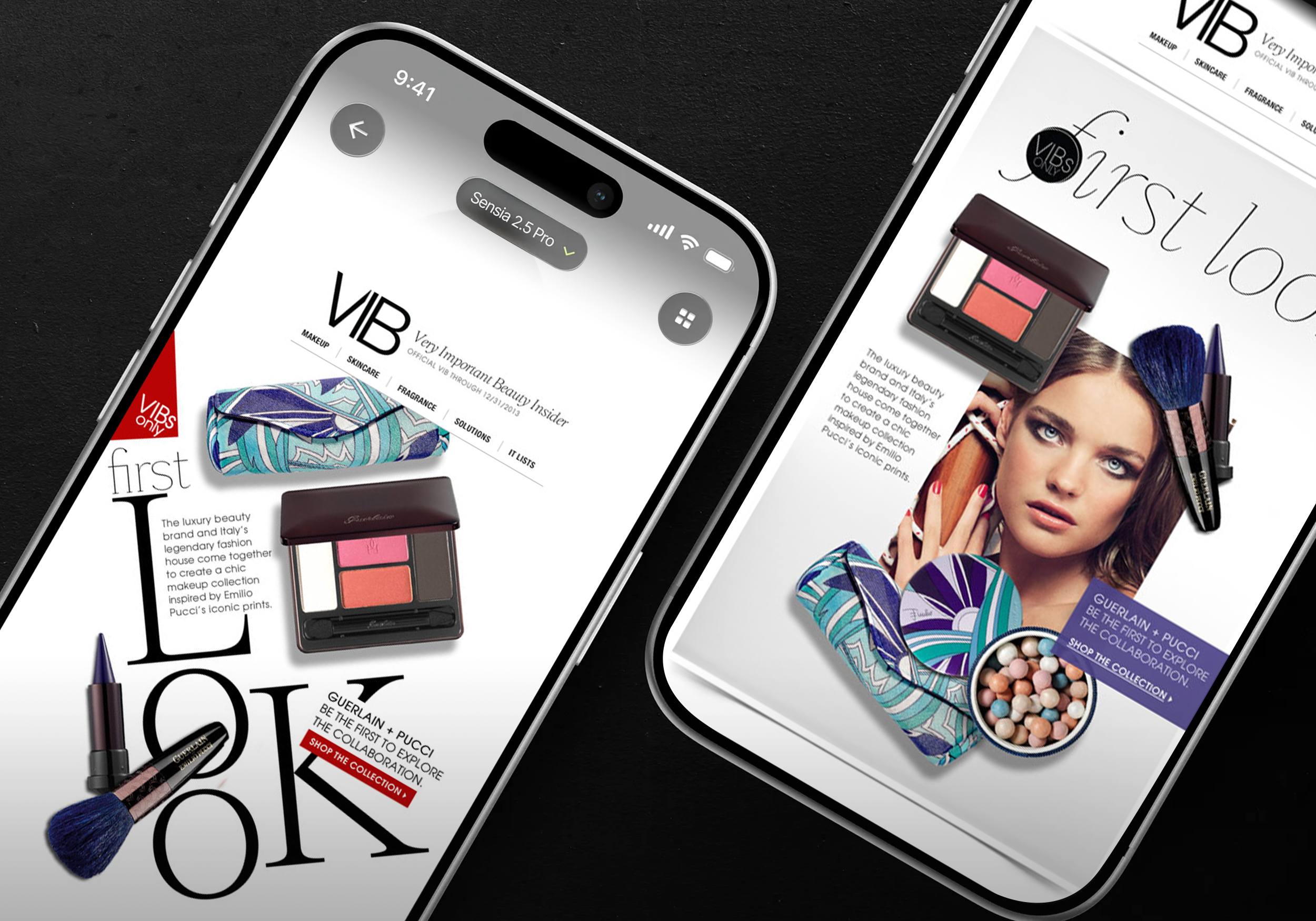
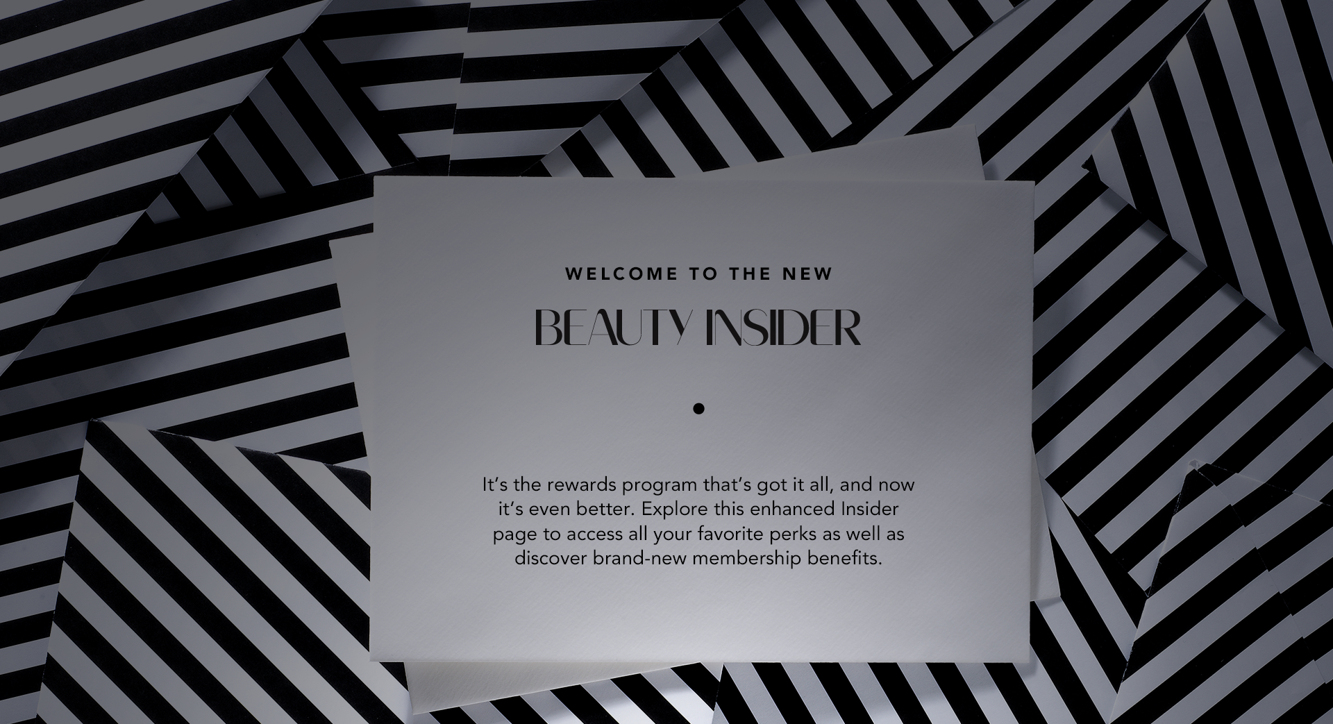
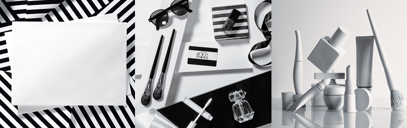
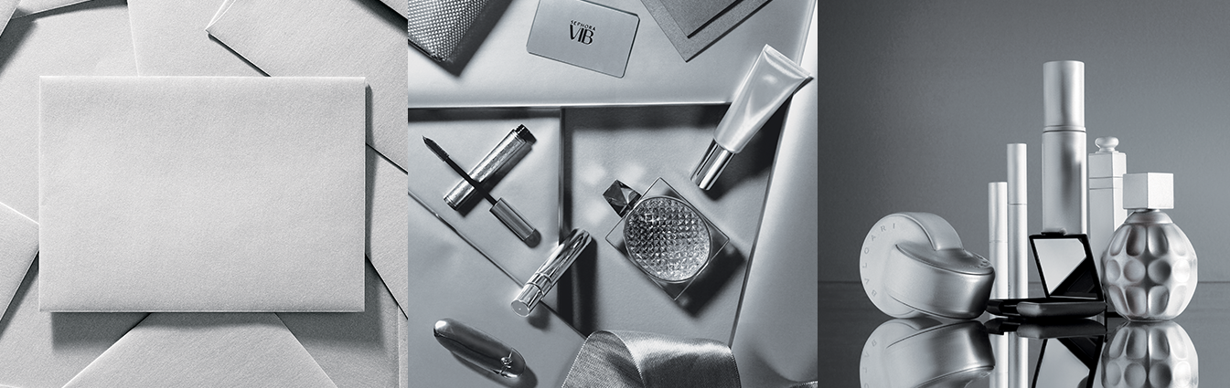
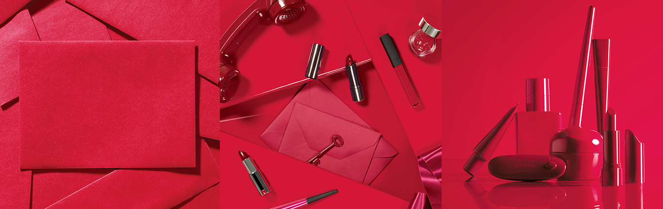
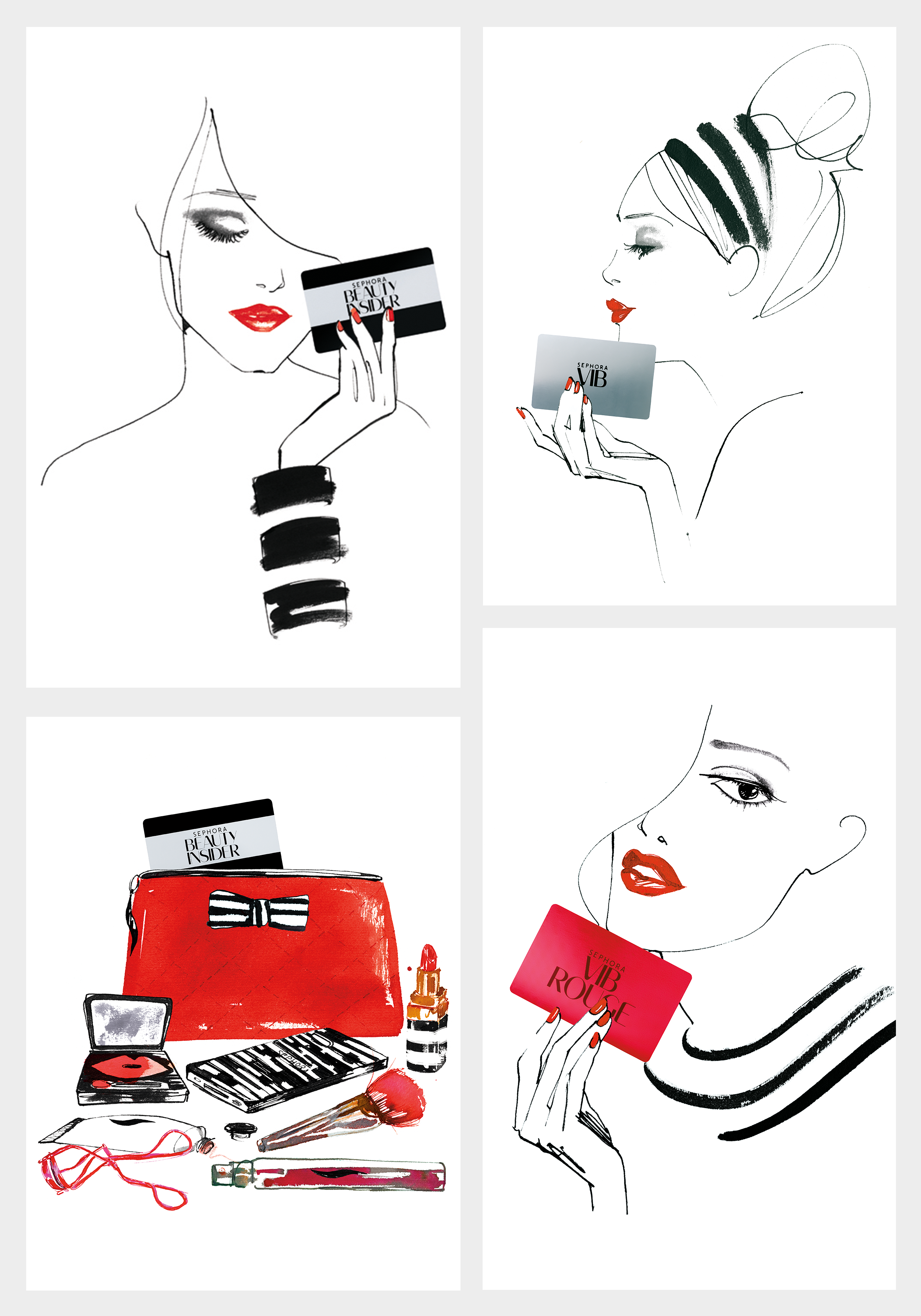
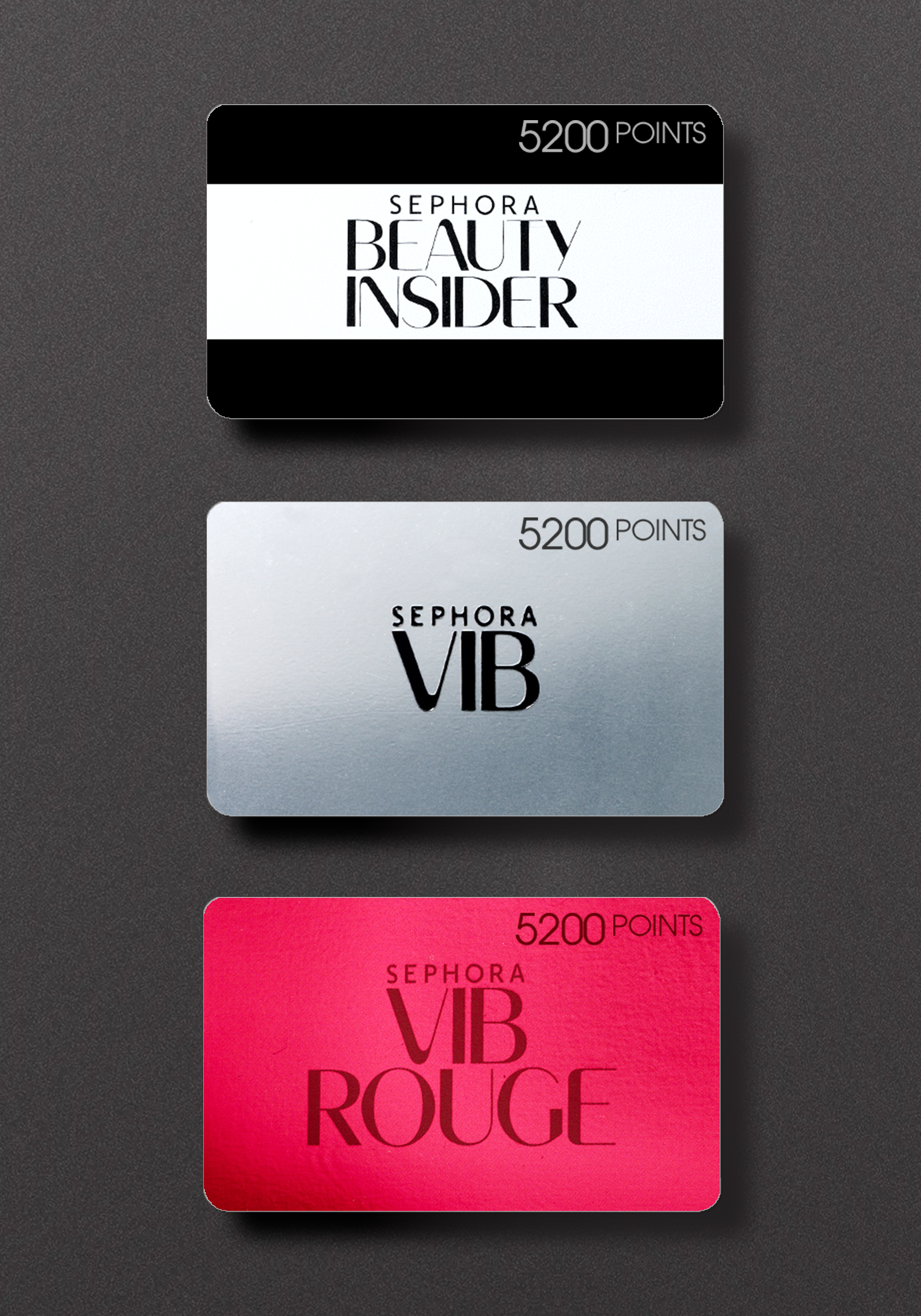
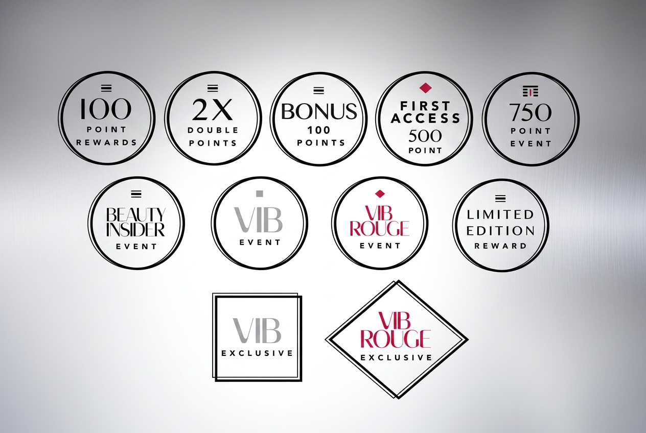
Approach: We rebuilt the loyalty framework around a clear color-and-pattern system: black stripes for Basic, silver metallic for VIB, red metallic for Rouge — so members could identify their tier and benefits instantly.
Outcome: Roughly a 20% increase in loyalty program participation, with a corresponding lift in sales.
Why the Brand Experience Mattered
The redesign treated the loyalty program as a brand experience, not just a transactional mechanic. Giving each tier a distinct, premium visual identity did two things at once: it let members instantly recognize their own status and benefits, and it made the tier above visibly more desirable — turning the design itself into part of the retention and upgrade strategy, rather than a UI treatment layered on top of one.