CarMax
Design system
Design systems (Illustration / icon / logo systems) · Company-wide scale
The value of the work extended beyond the assets themselves. I helped create clarity for other creatives through documentation, guidance, examples and feedback when applications needed to be brought back into alignment.
Context: As CarMax expanded the ways its brand appeared across marketing and customer experiences, the need for a clear and scalable visual system became increasingly important. I helped shape a flexible design language that could support everyday creative production while maintaining a recognizable CarMax point of view.
Challenge: A large brand ecosystem creates a familiar tension: teams need enough flexibility to solve different communication problems, yet enough consistency to ensure every experience feels unmistakably connected to the brand. The challenge was to create a system that gave designers useful guardrails without limiting creative thinking.
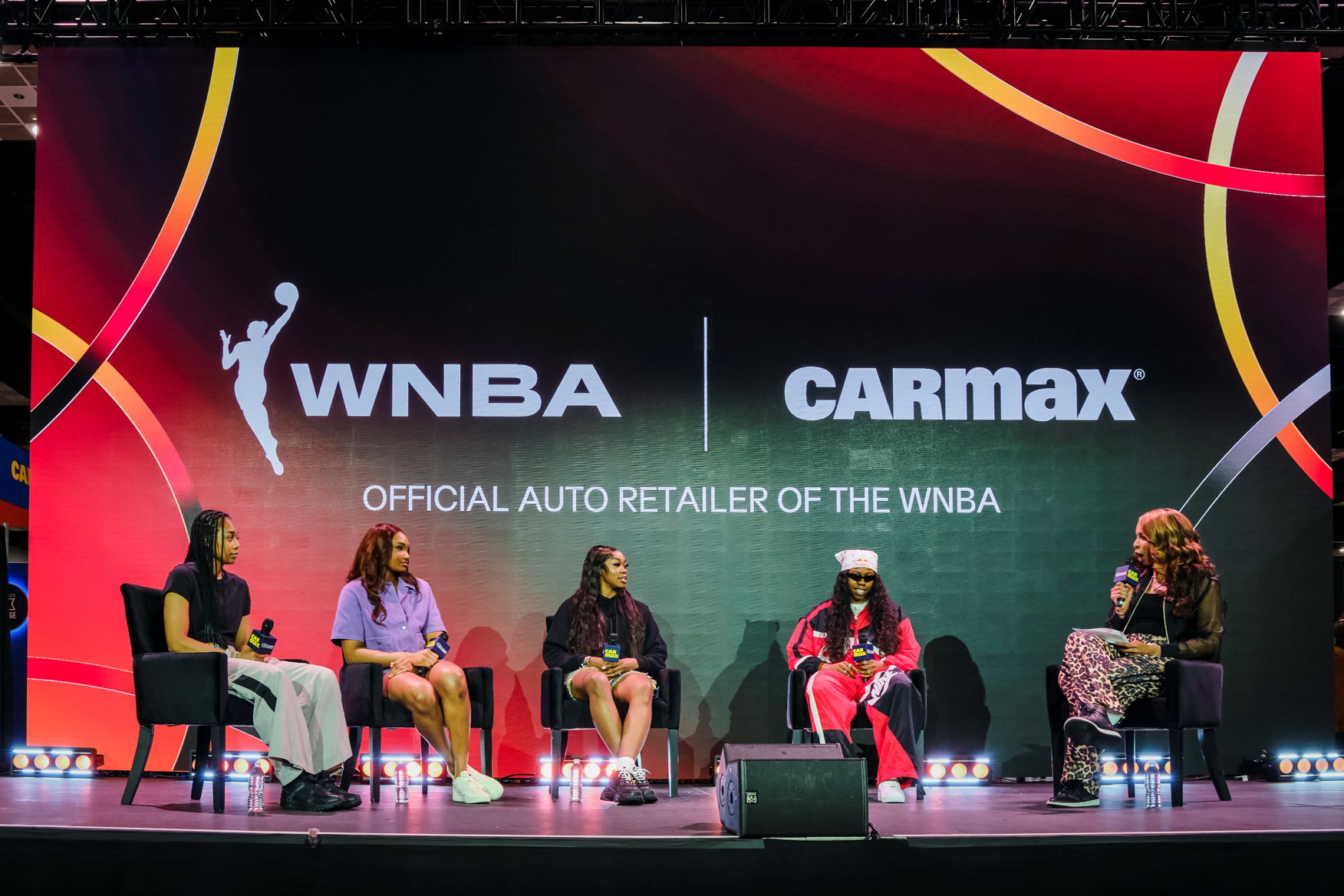
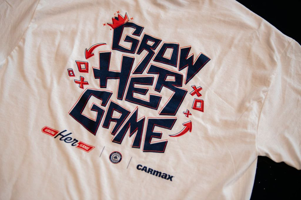
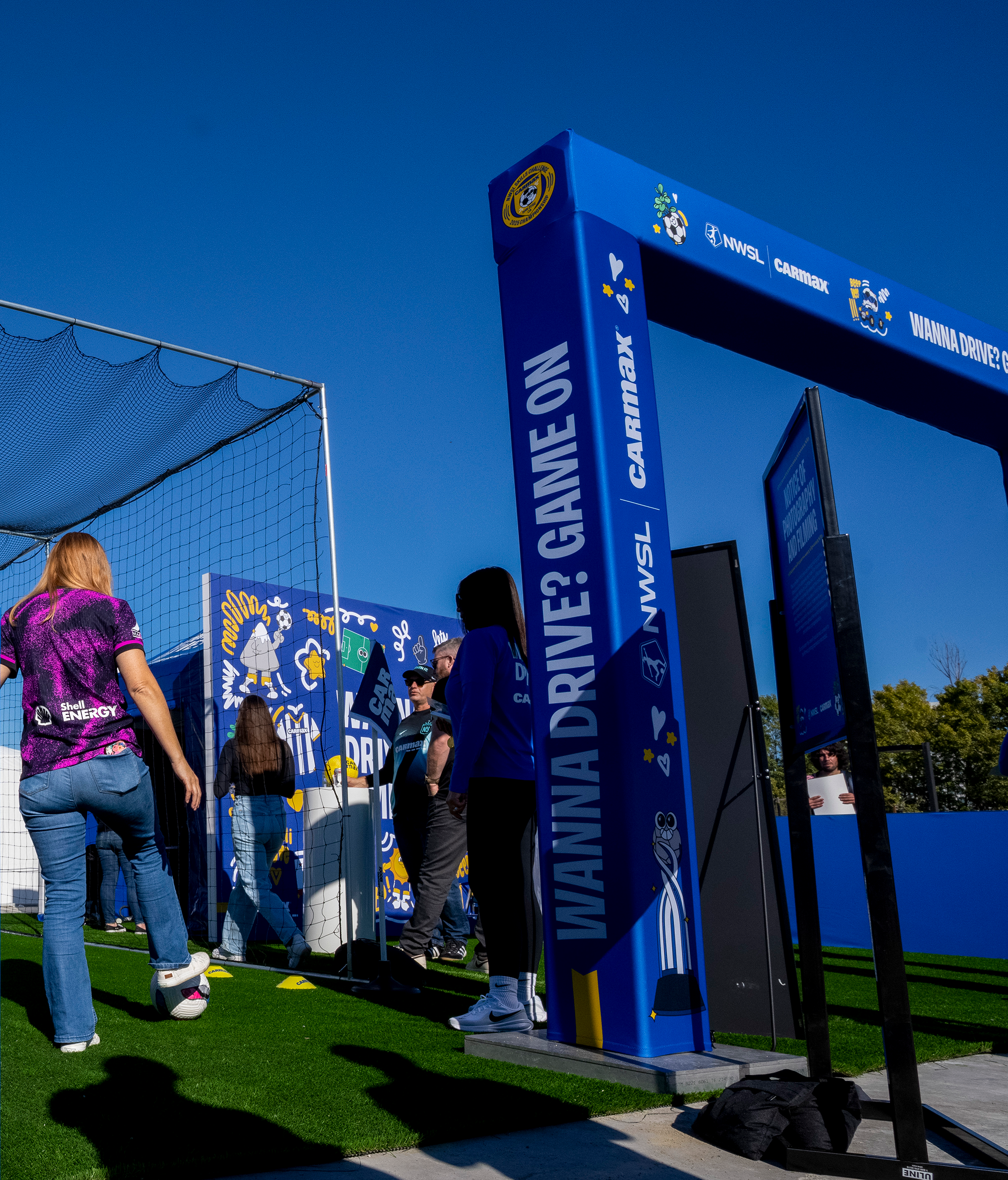
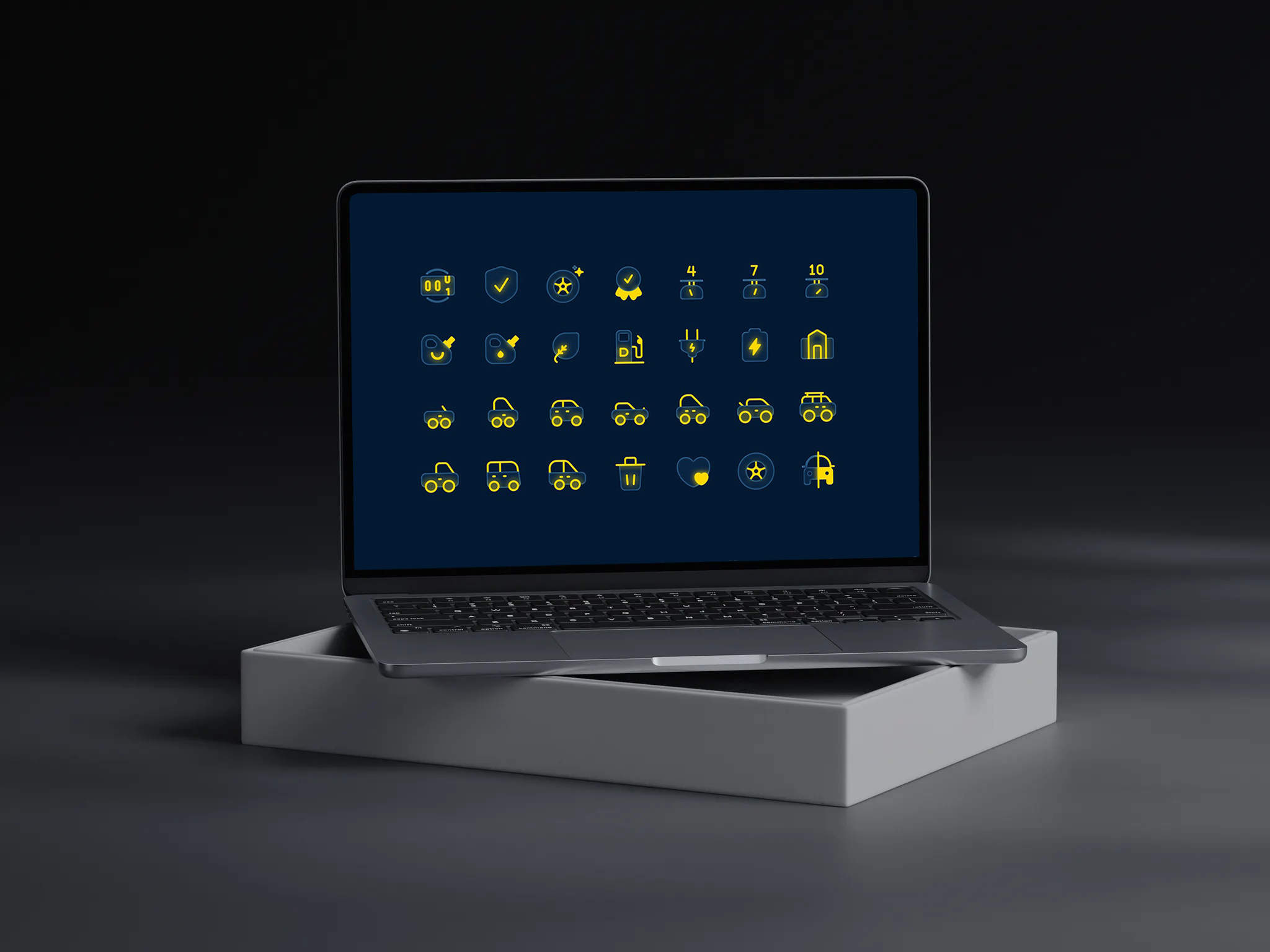
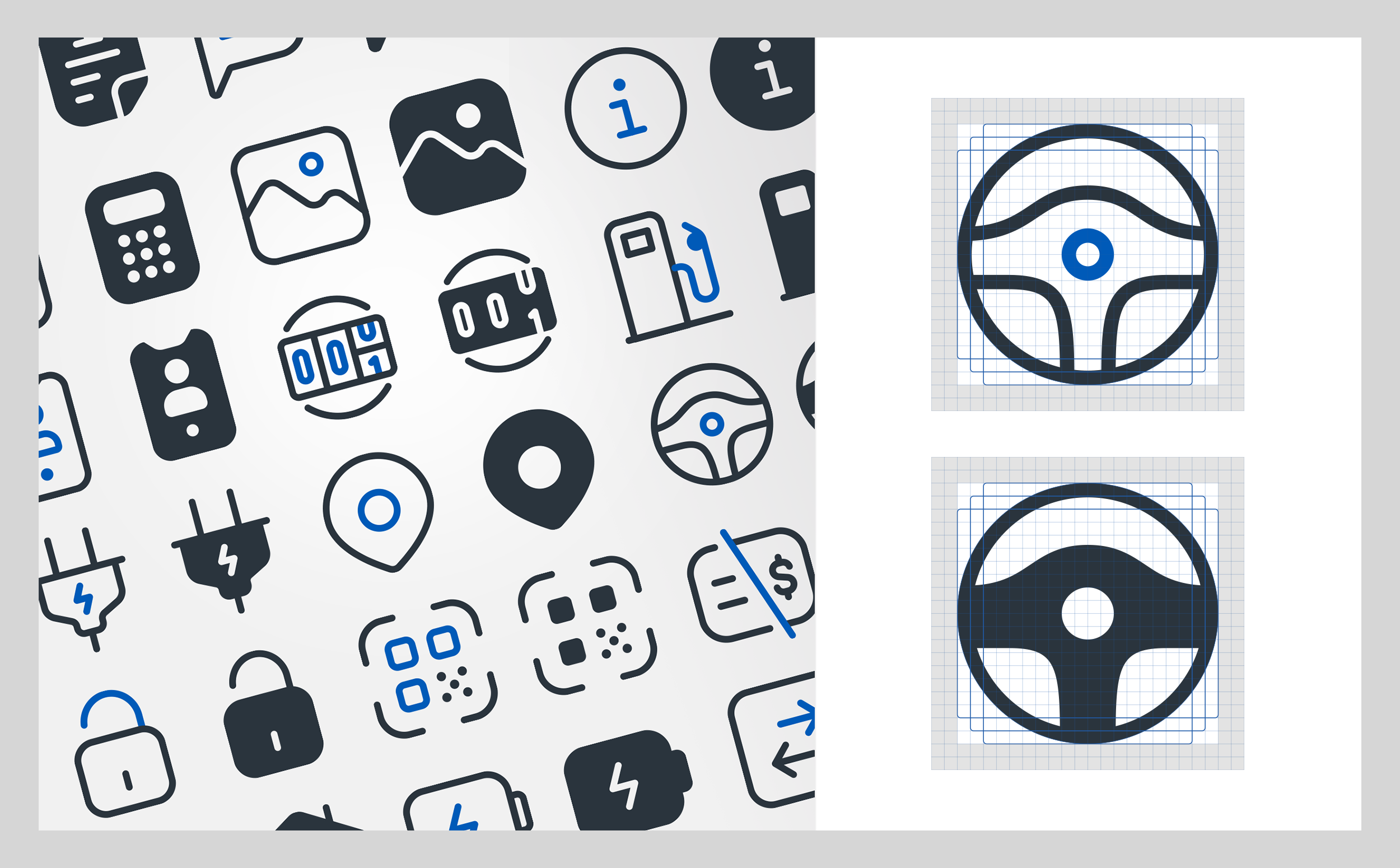
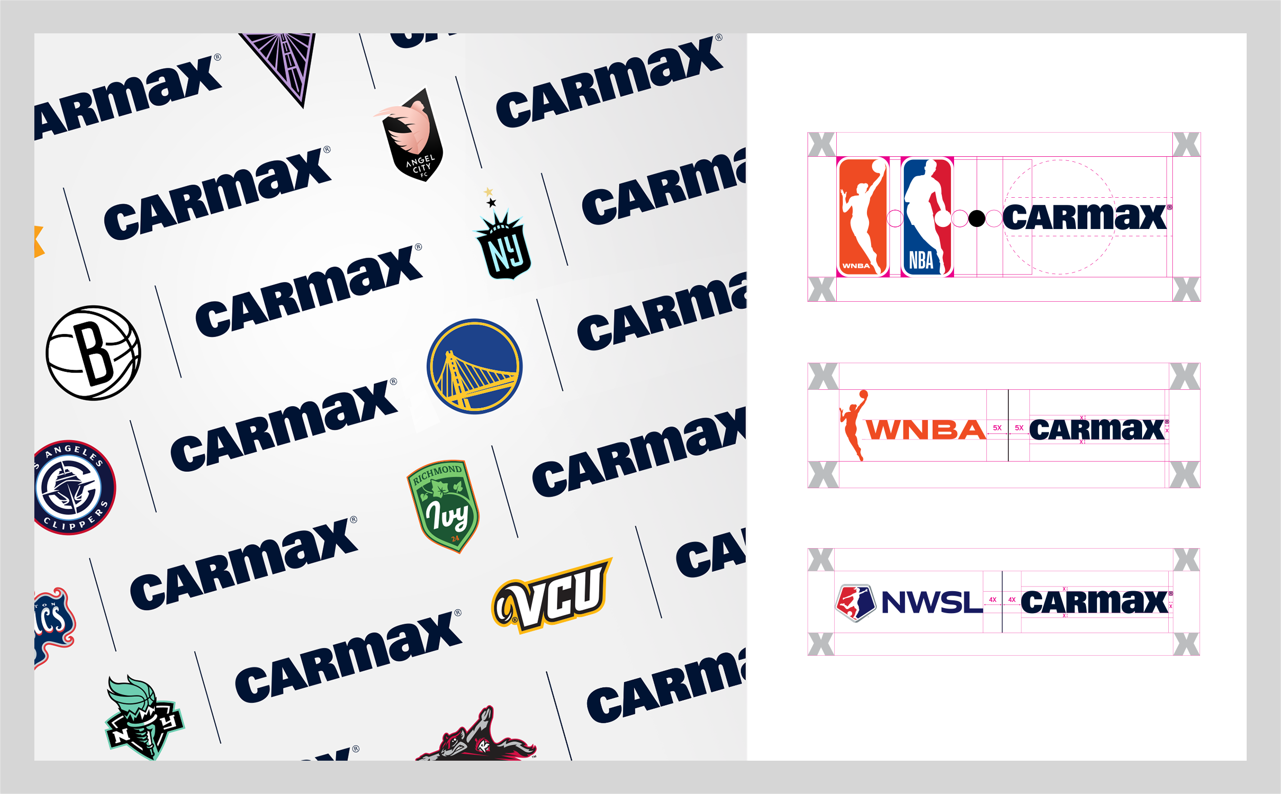
My Role: I contributed to the development and evolution of the design system, translating brand principles into practical tools and reusable components. I also worked across creative and marketing partners to clarify usage, improve consistency, and make the system easier for other designers to apply. I guided the team’s icon and illustration systems company-wide, and led the research and training behind a new sports-partnership logo system — training WNBA, NBA, NWSL, and local teams directly on how to apply it.
Approach: I focused on the balance between consistency and flexibility. This involved defining recognizable visual behaviors, creating reusable assets, and establishing clear guidance while leaving room for teams to respond to different audiences, formats, and campaign needs.
Impact: The resulting system created a stronger foundation for consistent brand expression and gave teams a more practical framework for moving from brand principles to execution.
Leadership, Stakeholder Collaboration & Team Enablement
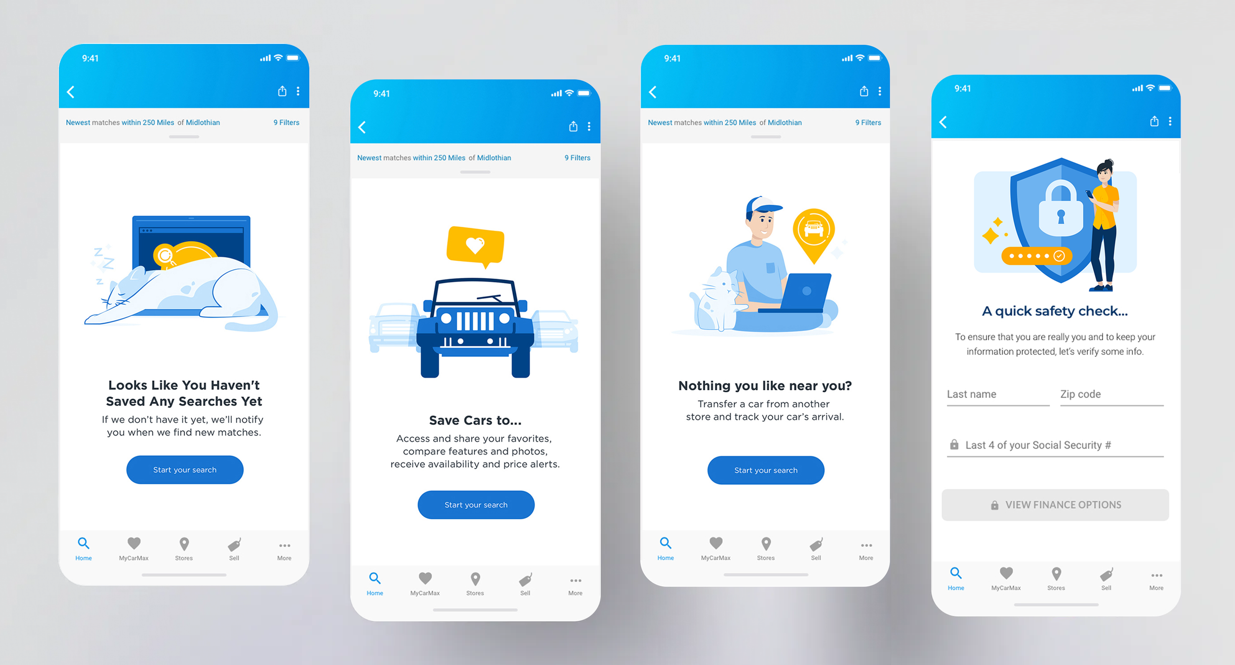
My role here was less “designer producing assets” and more “systems lead building the tools other teams needed to stay on-brand without me in the room.” For the icon and illustration system, I guided the team through a style discovery process and translated the findings into a three-tier fidelity system that internal designers could apply consistently across sizes and use cases.
On the sports-partnership side, I led the research myself — auditing how partner logos were sized and placed across different leagues and teams — then built a proportion-based template and delivered direct training to the WNBA, NBA, NWSL, and local team marketing staff. That training was the enablement piece: instead of having partner teams review every partner asset personally, I gave them a system they could apply correctly on their own.
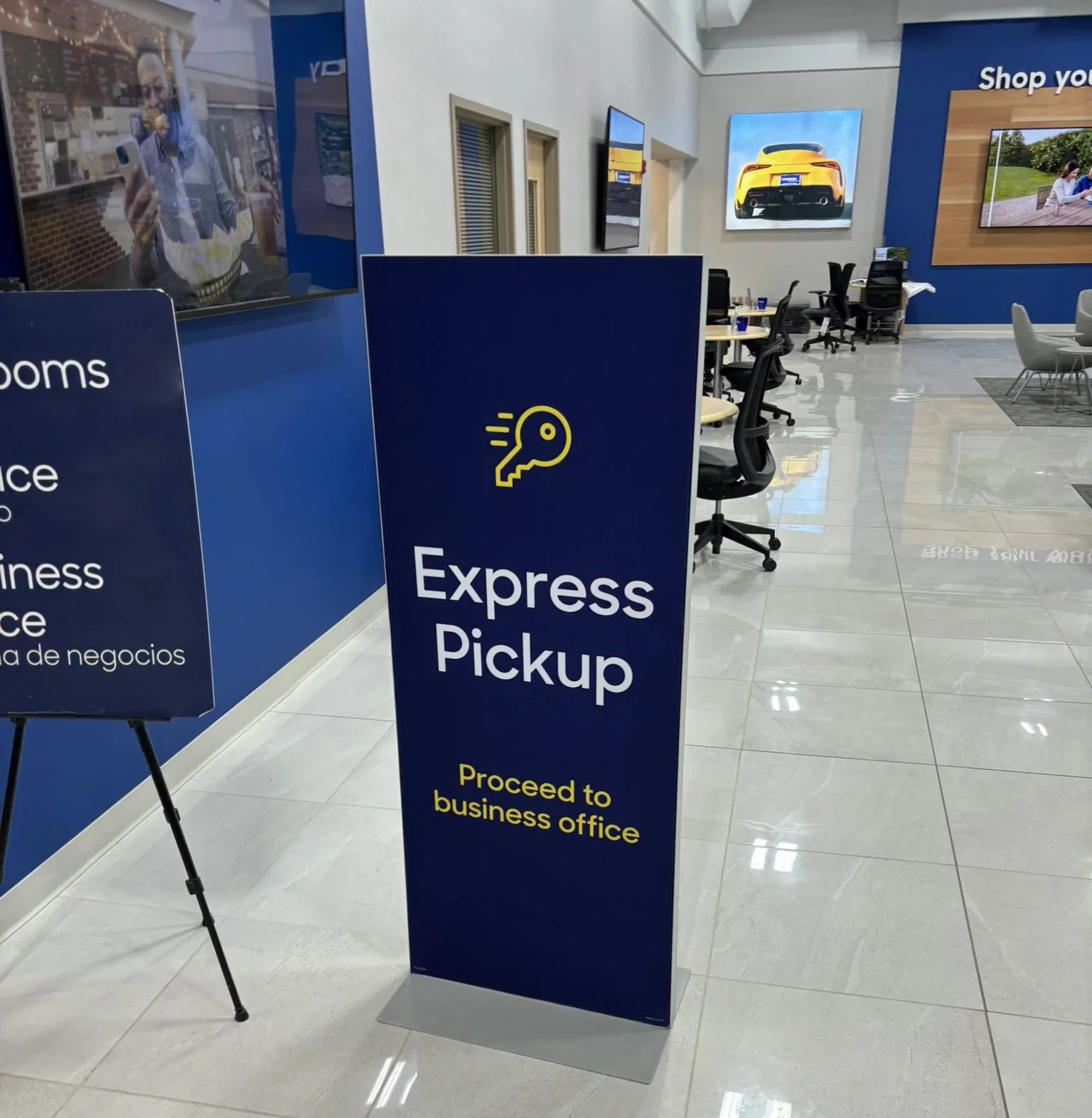
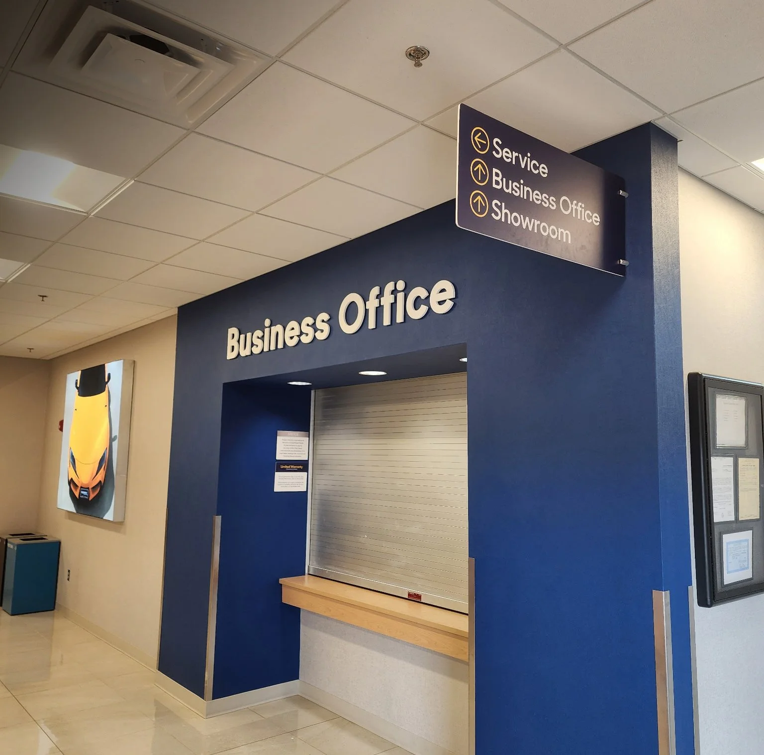
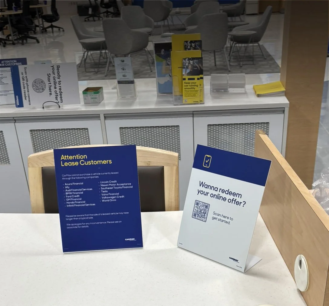
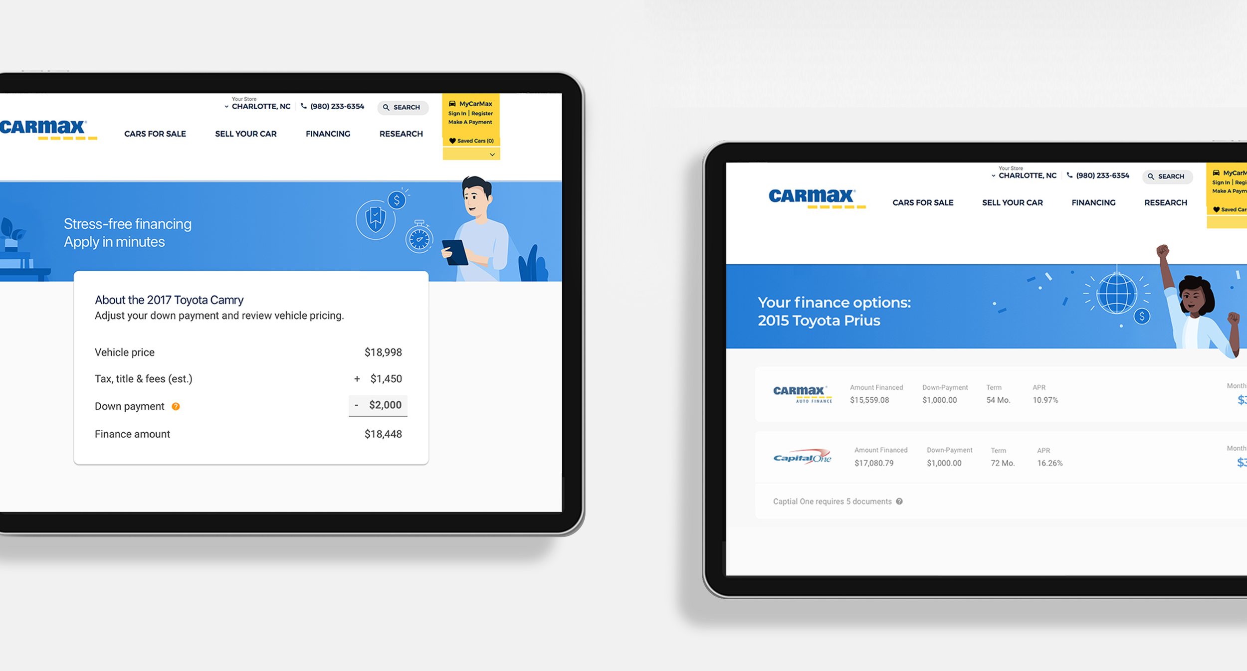
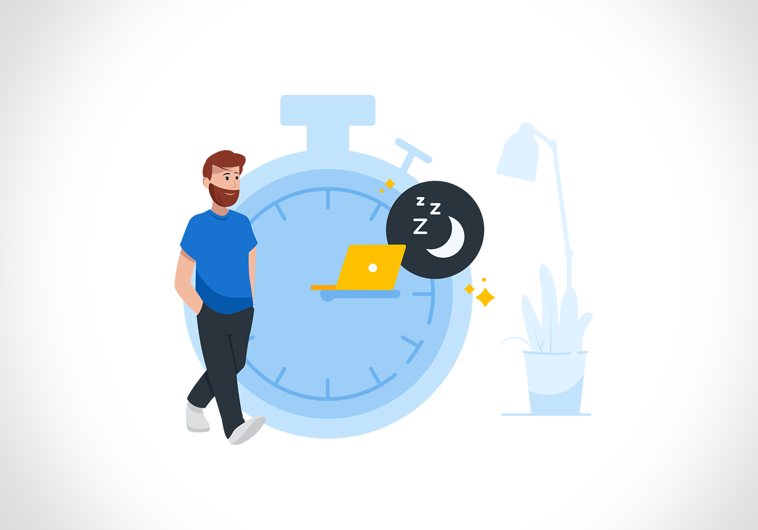
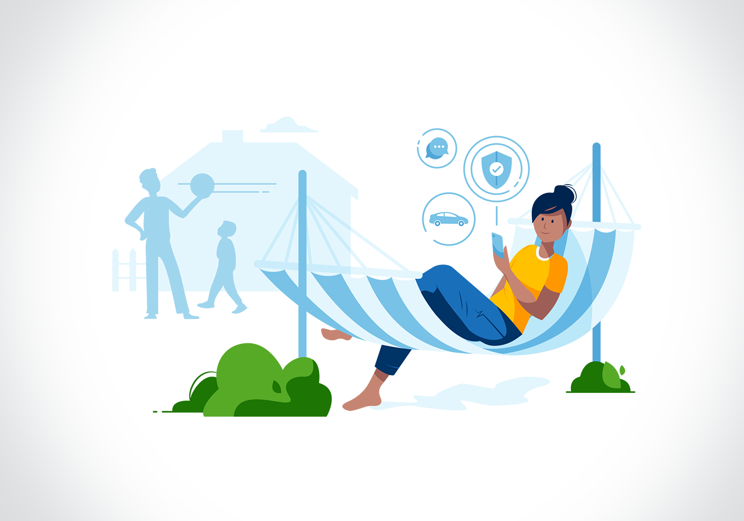
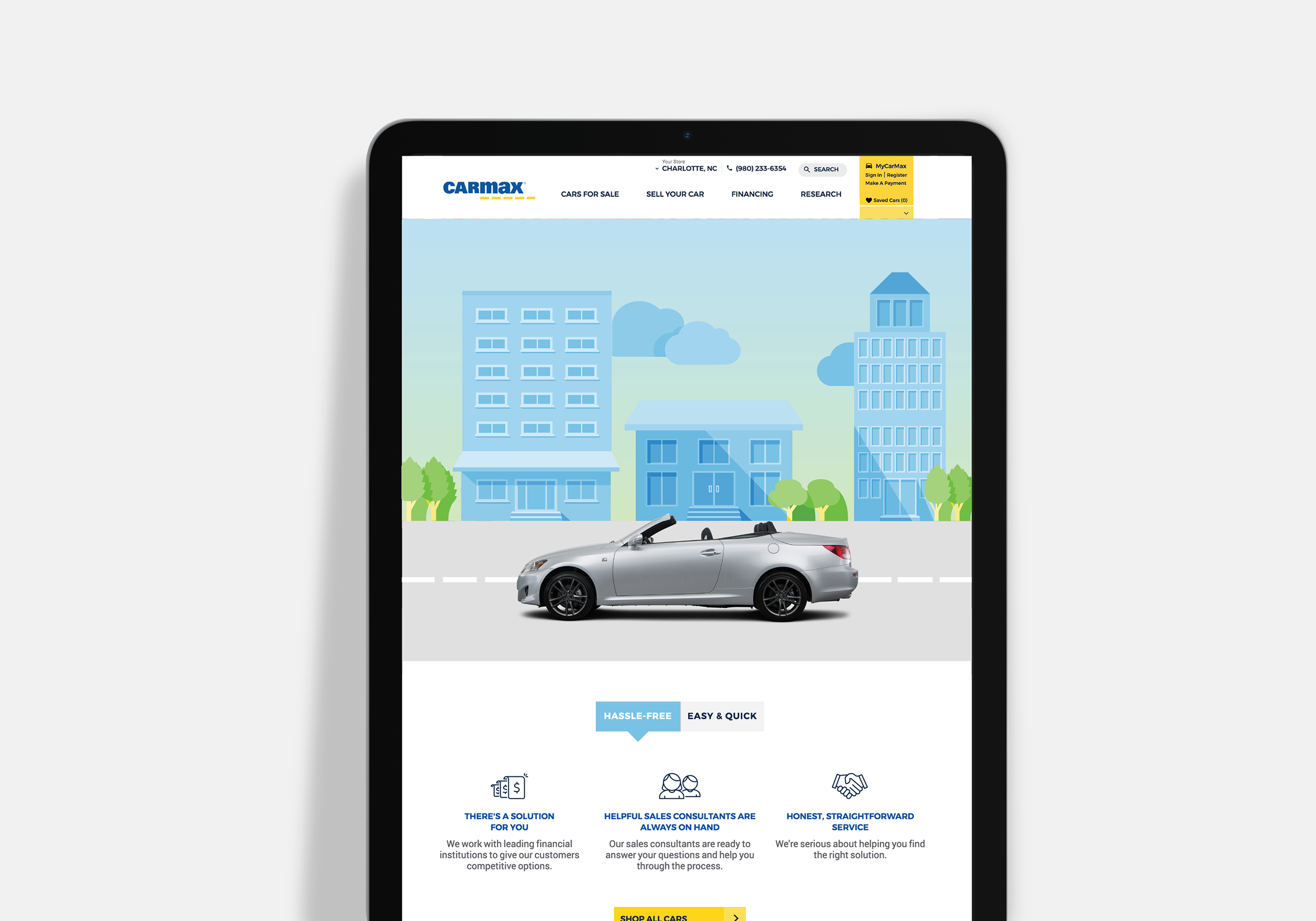
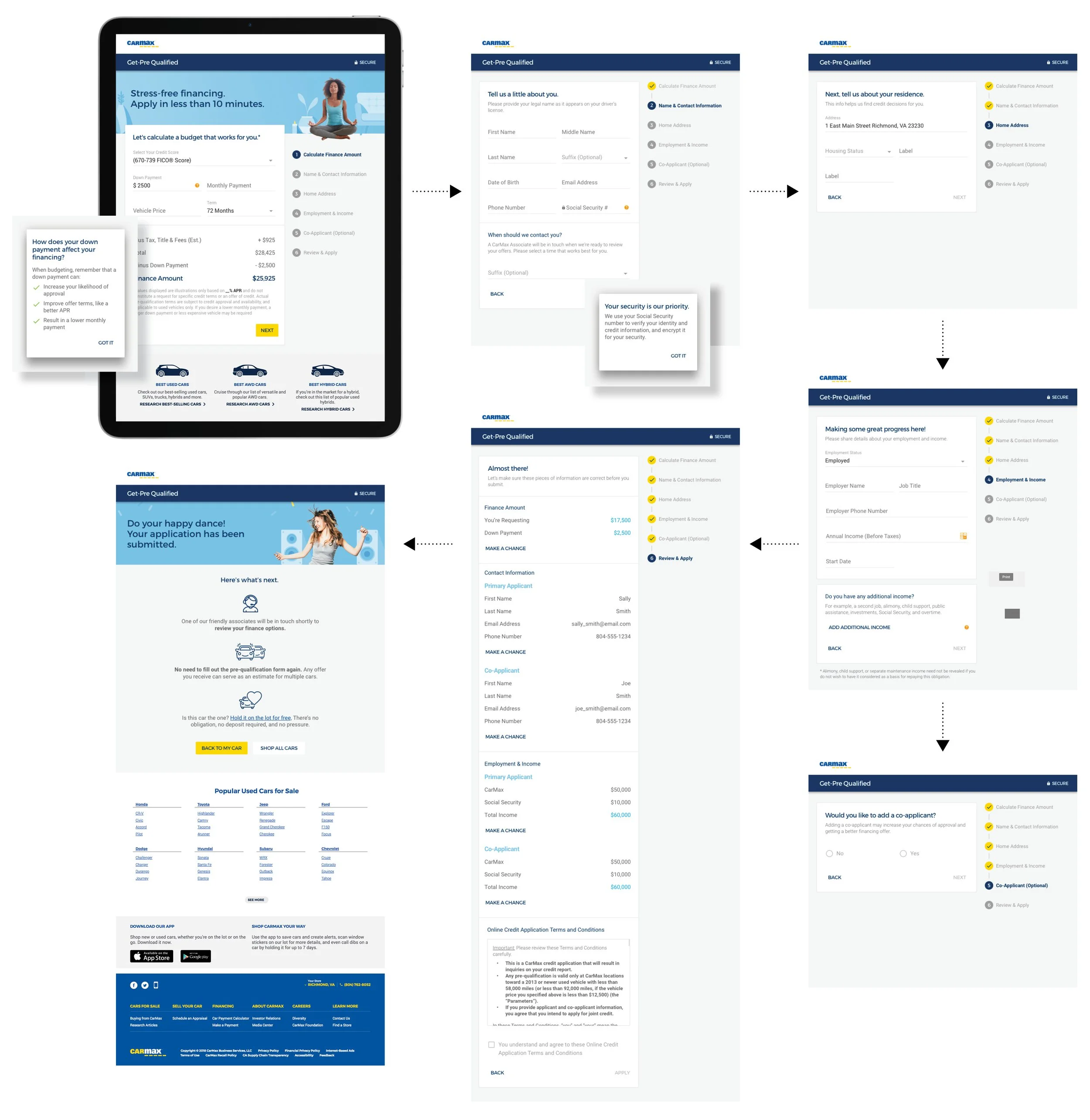
On the site’s illustration system, I worked cross-functionally with the product team’s UX/UI designers, the store team, and an external illustrator to align on a graphic language — illustration as a supporting backdrop, photography as the lead — that had to work across physical and digital touchpoints simultaneously. That meant building consensus across teams with different priorities (conversion-focused product design, brand-focused marketing, and in-store experience) before the system could ship.