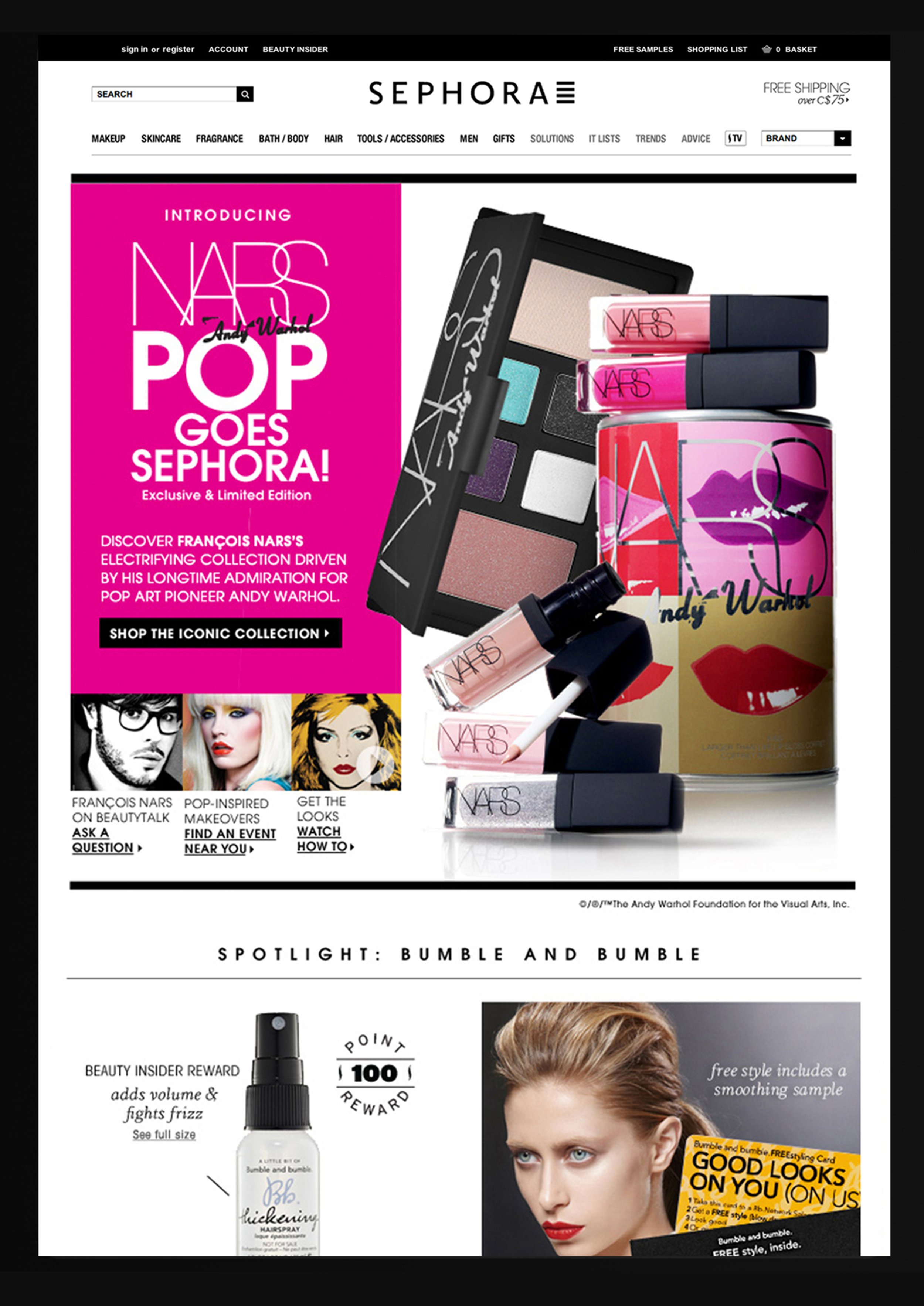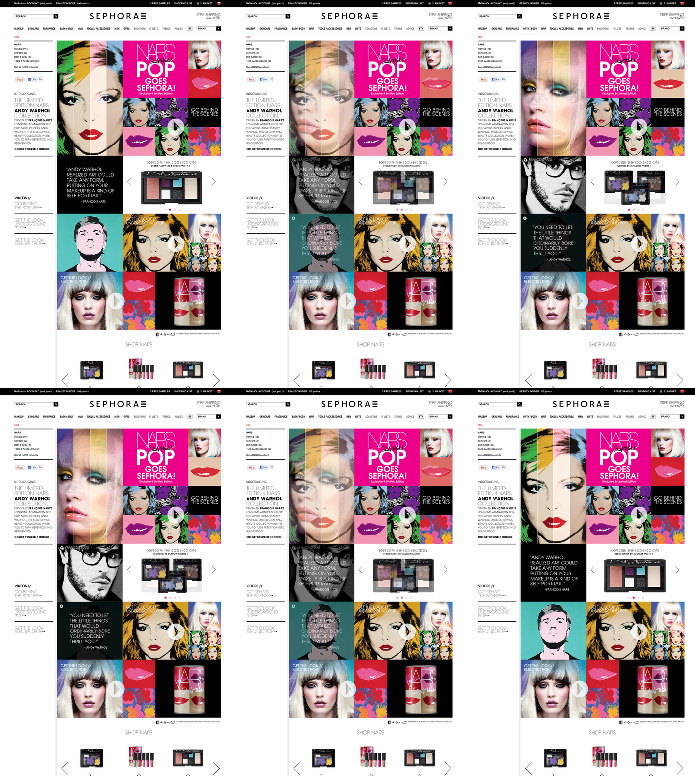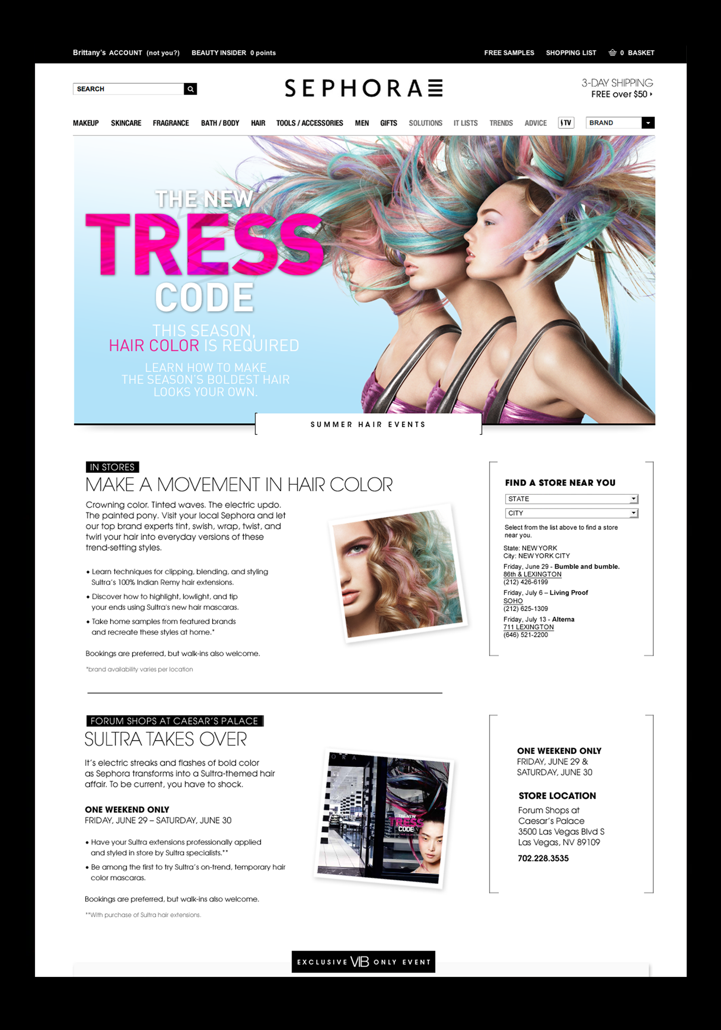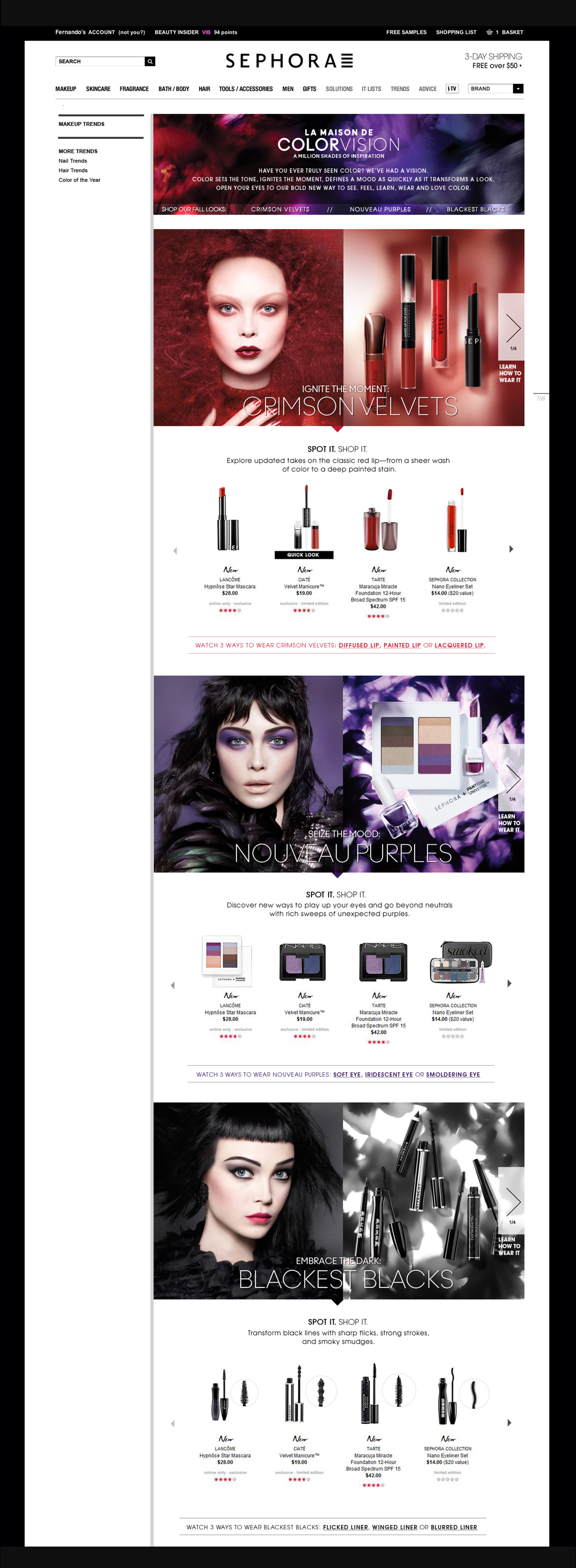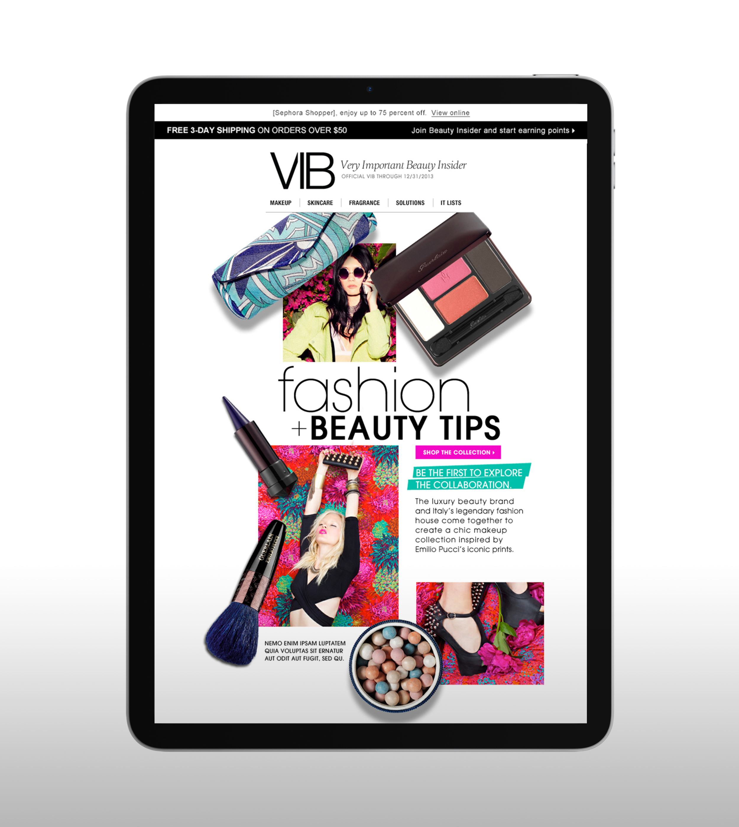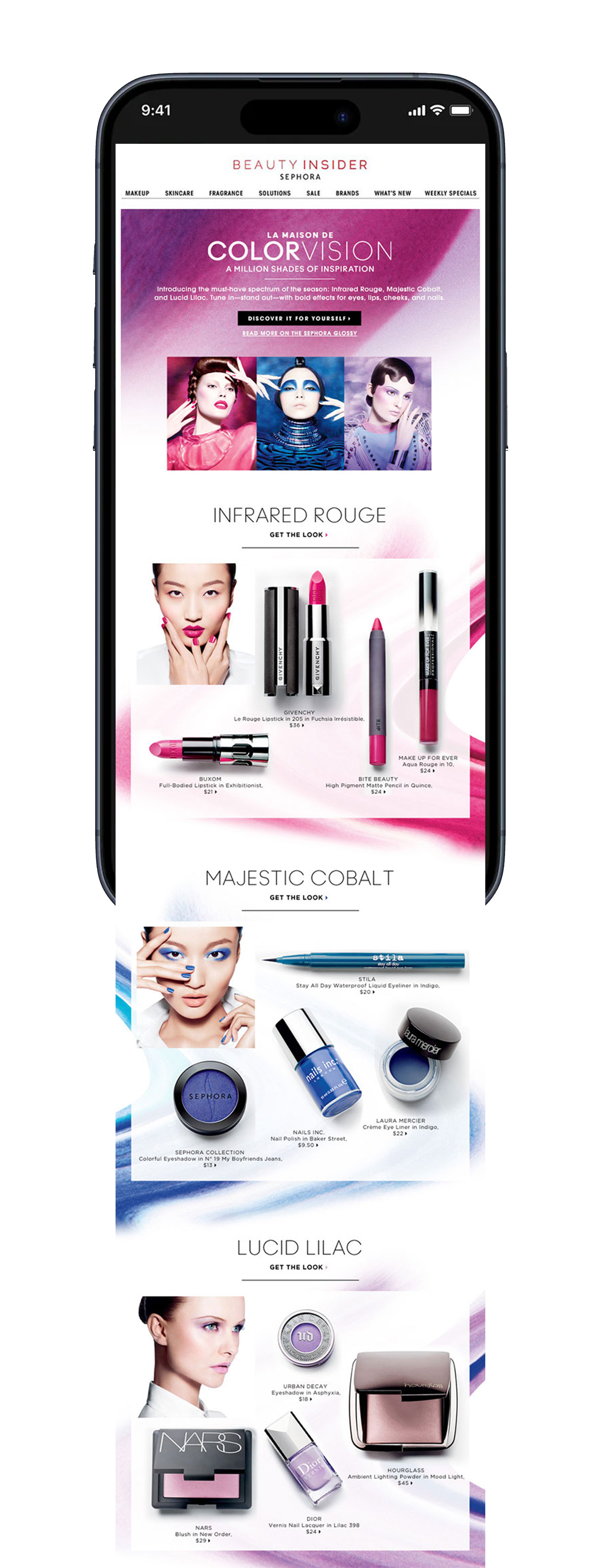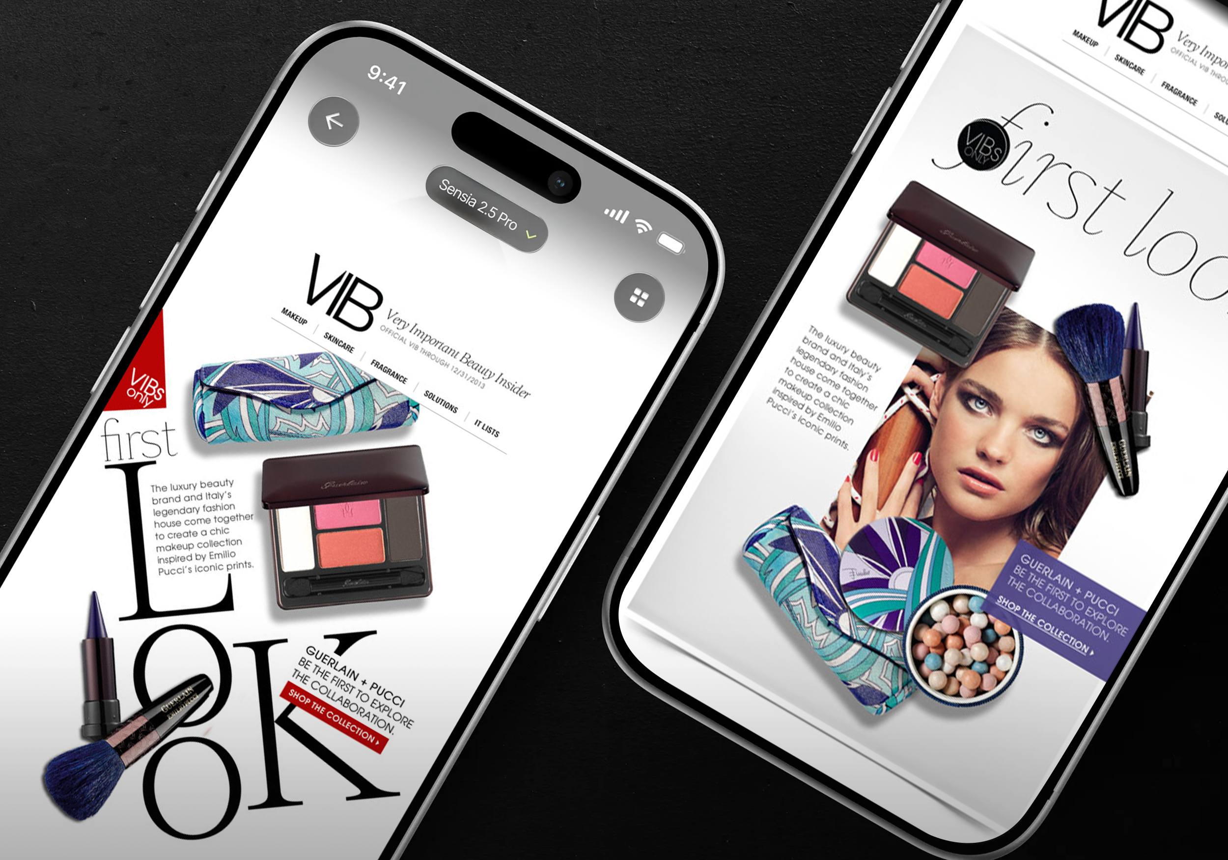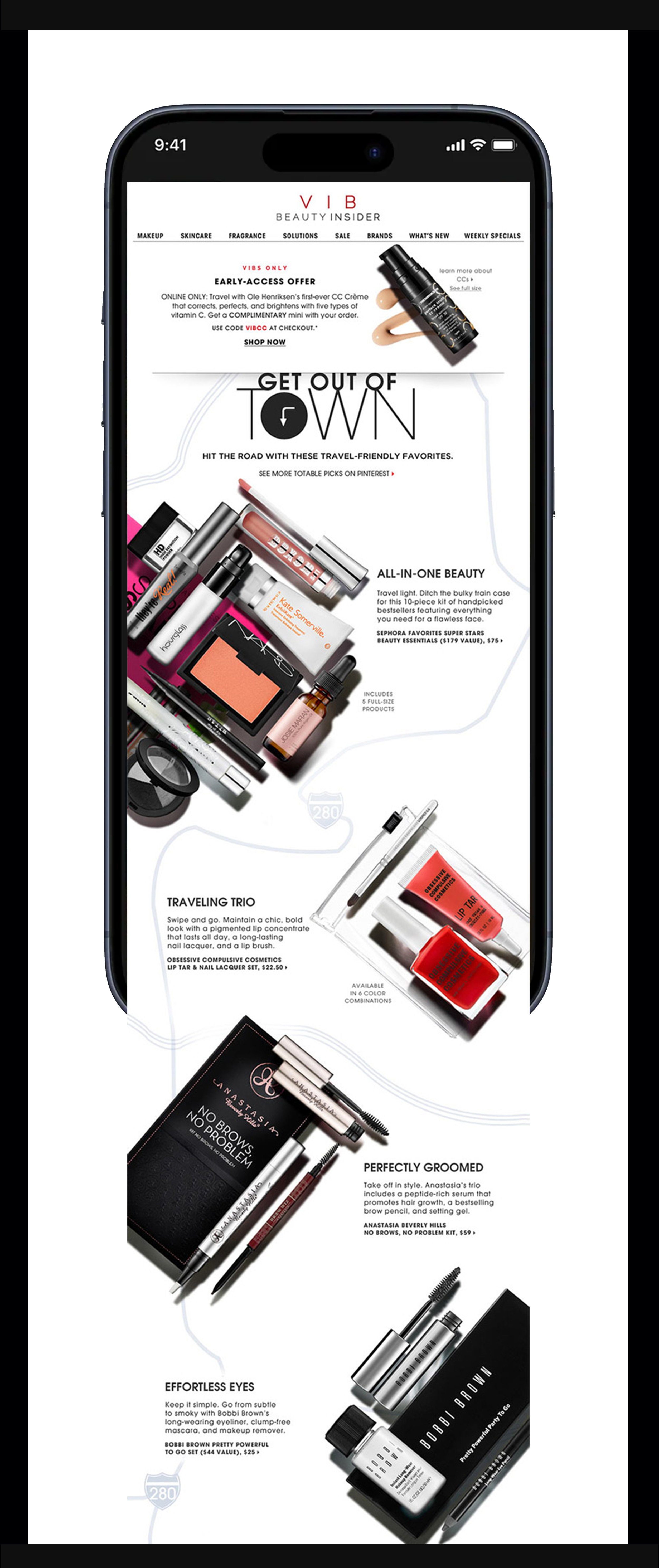
Sephora
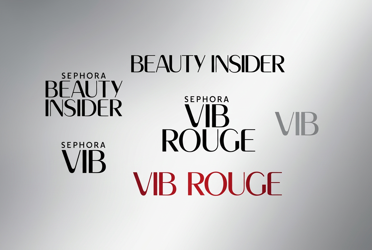
Beauty Insider membership program Rebranding
People leadership (team of 2 & studio) · Campaign + email · Loyalty program design system
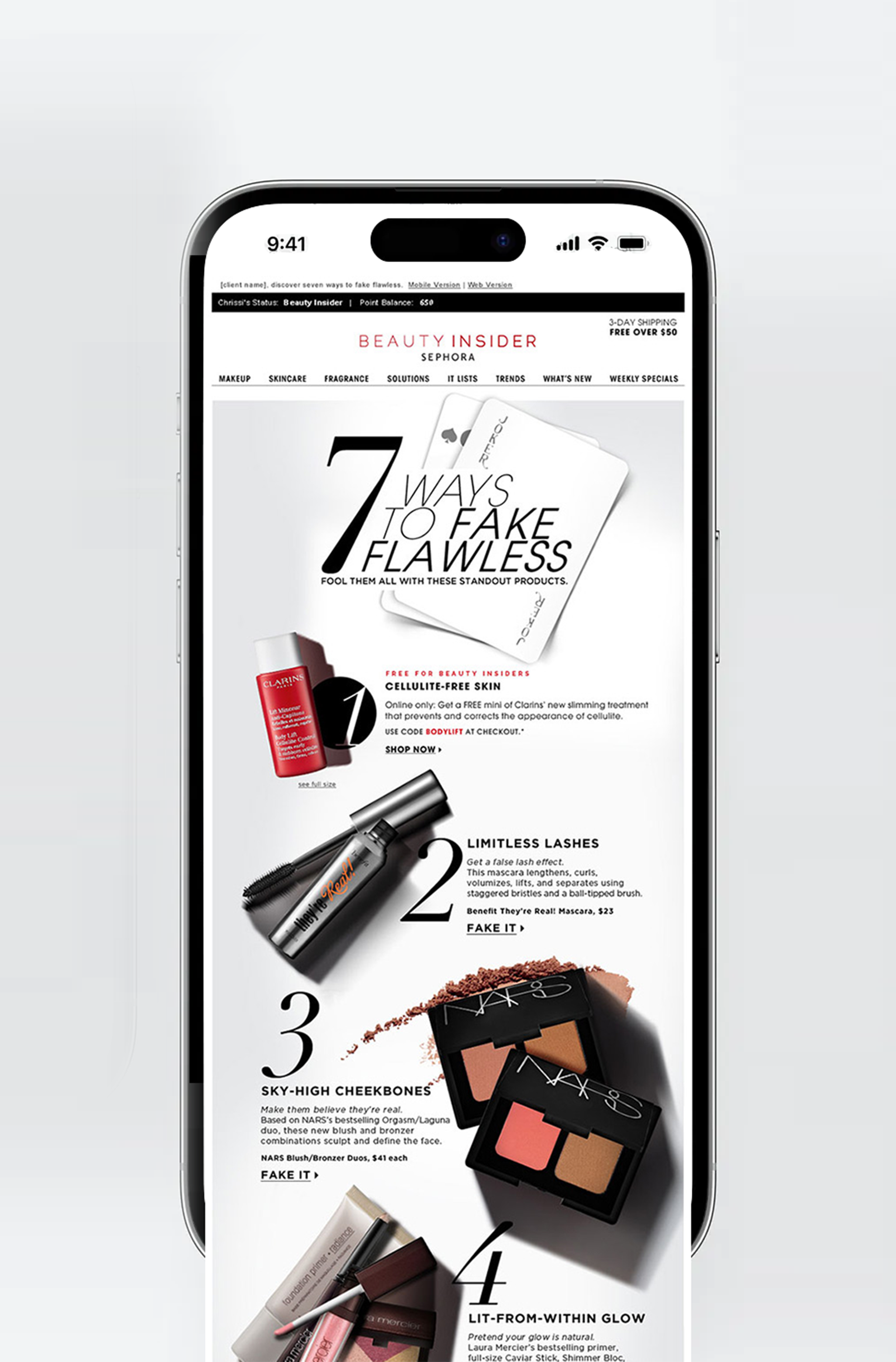
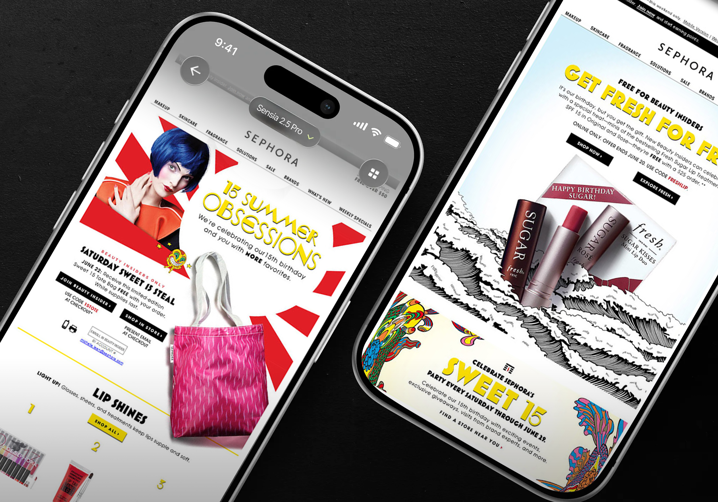
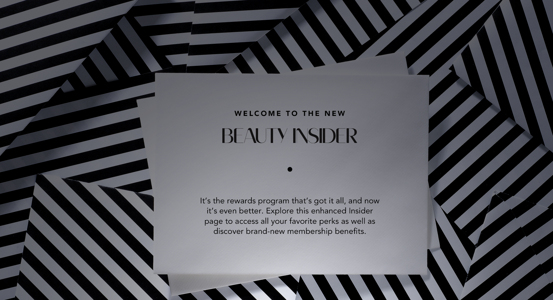
Context: Brand identity becomes meaningful when it moves beyond a logo and begins to shape how people experience an organization. This work explored how visual identity and brand expression could come together to create a cohesive experience for Sephora. The Beauty Insider loyalty program is the mechanism that turns one-time shoppers into repeat, higher-spending members, so it needed to feel like one seamless experience across physical and digital touchpoints.
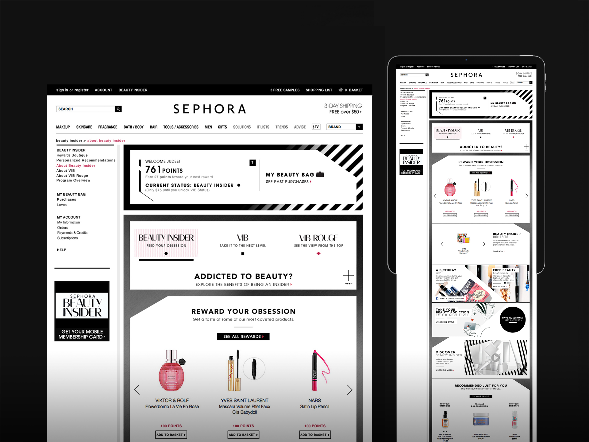
Challenge: The opportunity was to create a distinctive expression that could work across multiple brand touchpoints while retaining the energy, clarity, and recognition associated with the brand. A business problem (members couldn’t see the next tier clearly enough to be motivated to spend toward it) and an audience problem (across hundreds of competing brands and messages, members had no fast way to recognize their own status and benefits).
My Role: I contributed to the creative development and visual direction, translating the broader brand idea into a cohesive set of visual expressions and applications.
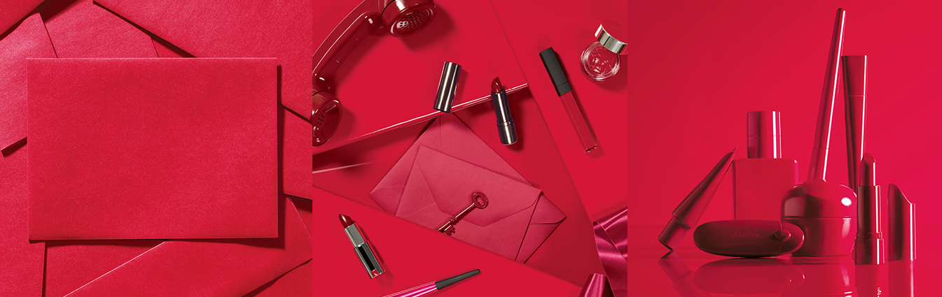
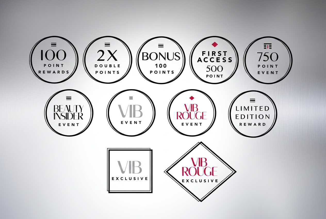
Approach: I focused on the relationship between identity, typography, imagery, composition, and application—making sure the system could create strong individual moments while still feeling part of a larger brand experience. Rather than treating each deliverable as a standalone design problem, I approached the work as a system of decisions. That mindset helps teams create more consistent work and gives a brand a stronger point of view over time.
Impact: The work demonstrated how a clear visual direction can connect individual executions into a cohesive brand experience.


Why the Brand Experience Mattered
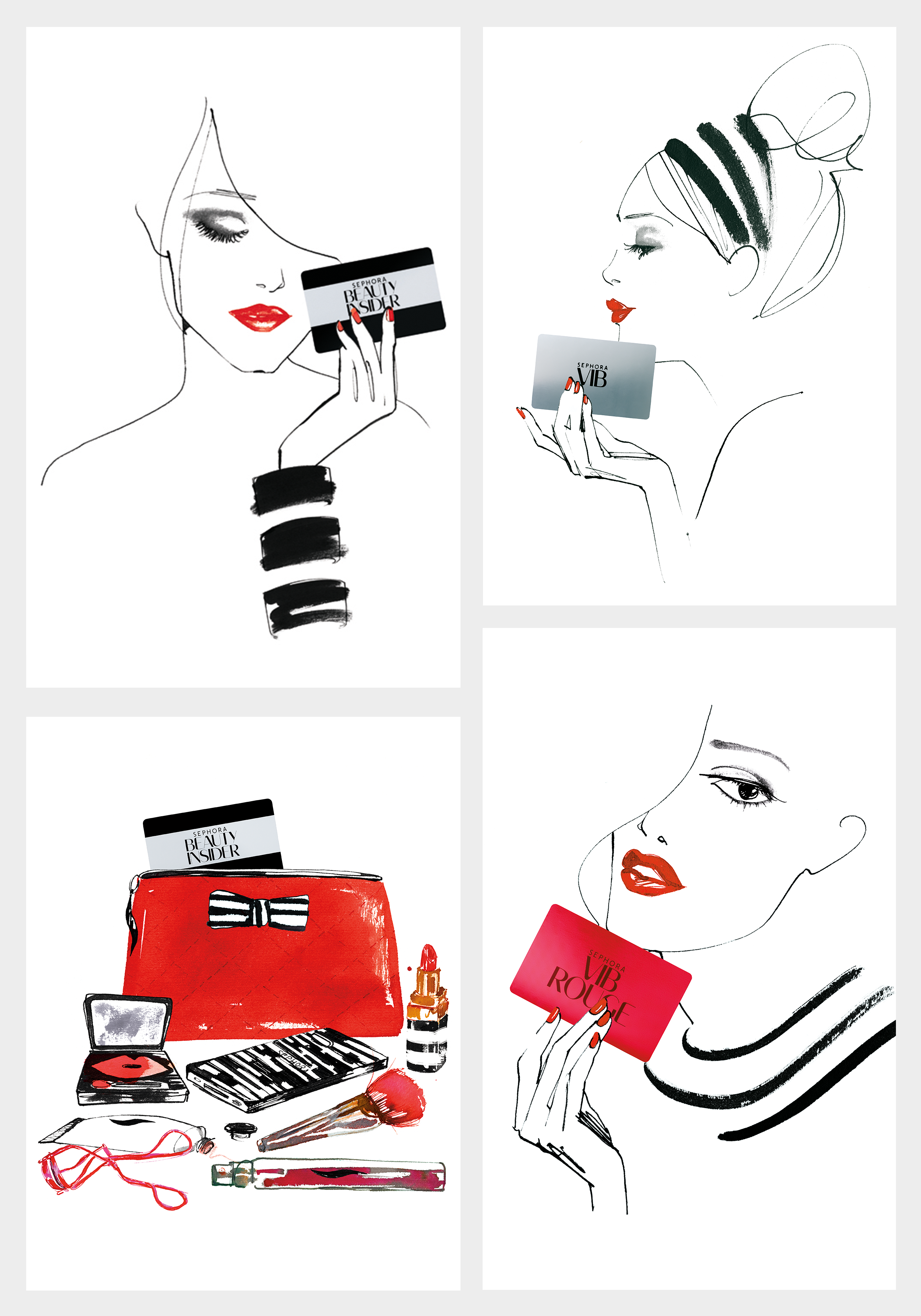
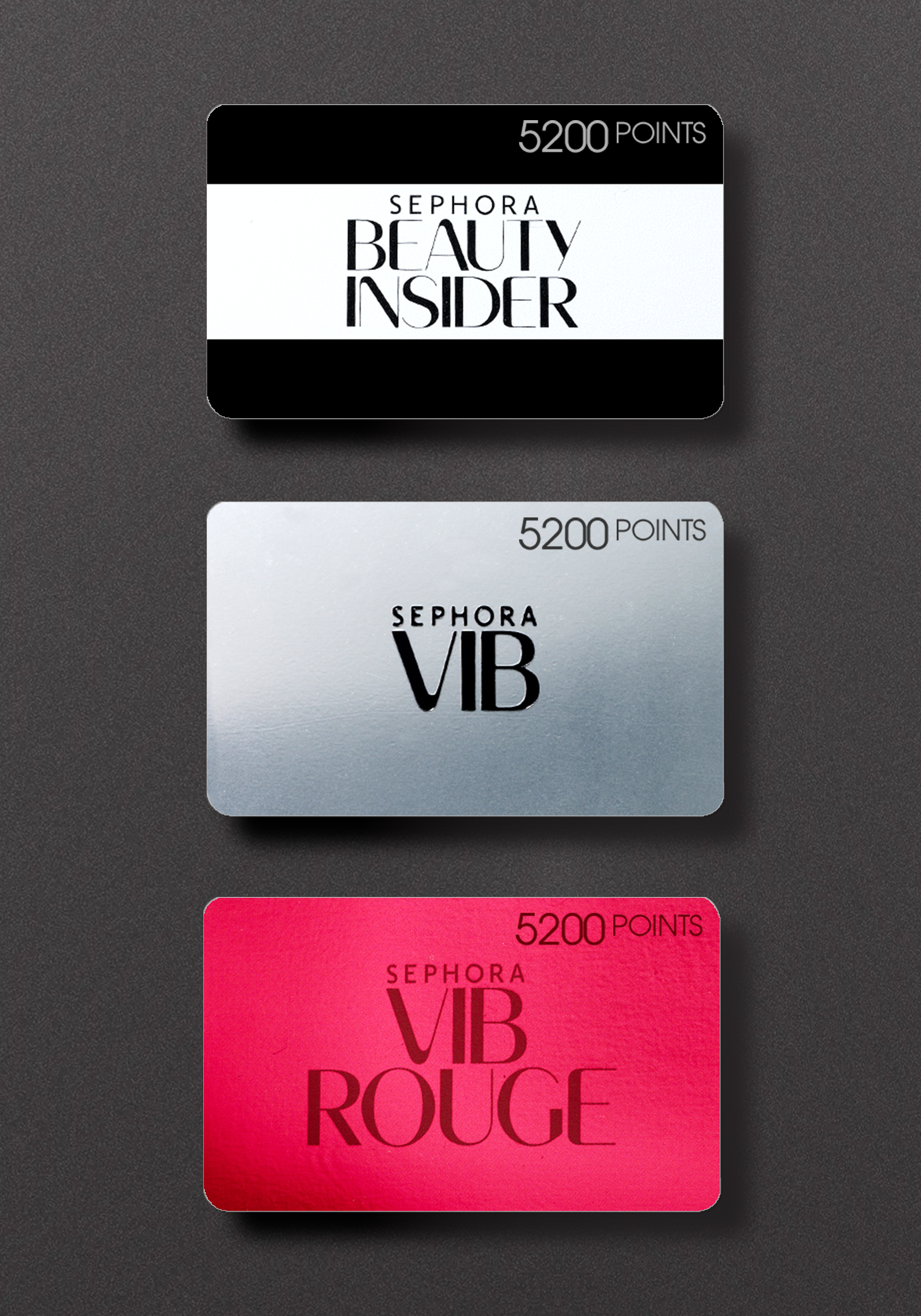
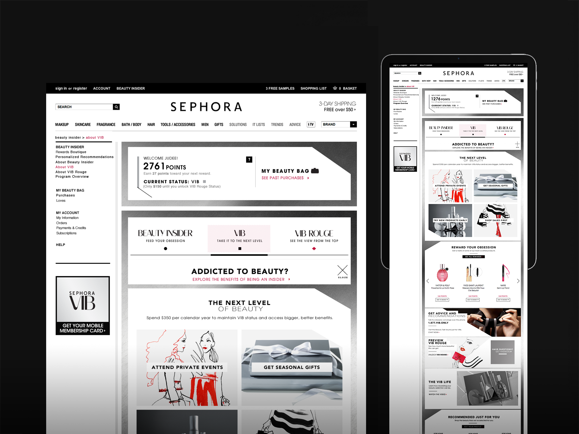
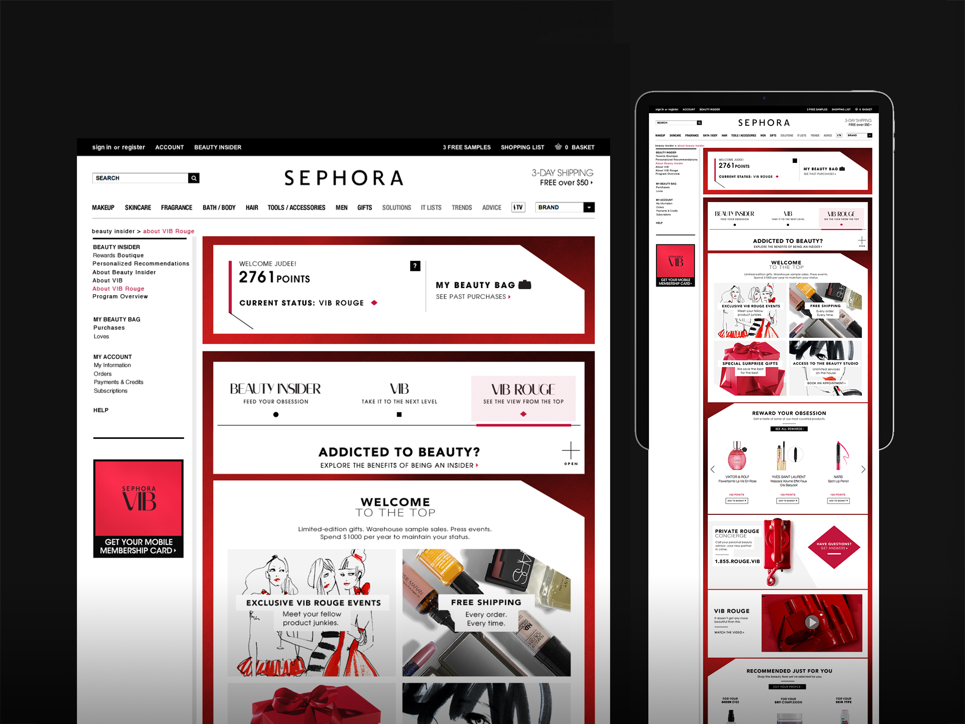
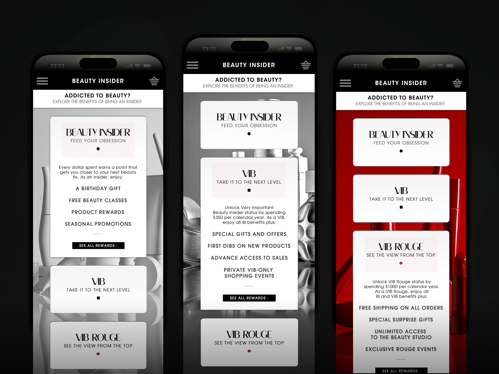
The redesign treated the loyalty program as a brand experience, not just a transactional mechanic. Giving each tier a distinct, premium visual identity did two things at once: it let members instantly recognize their own status and benefits, and it made the tier above visibly more desirable — turning the design itself into part of the retention and upgrade strategy, rather than a UI treatment layered on top of one.
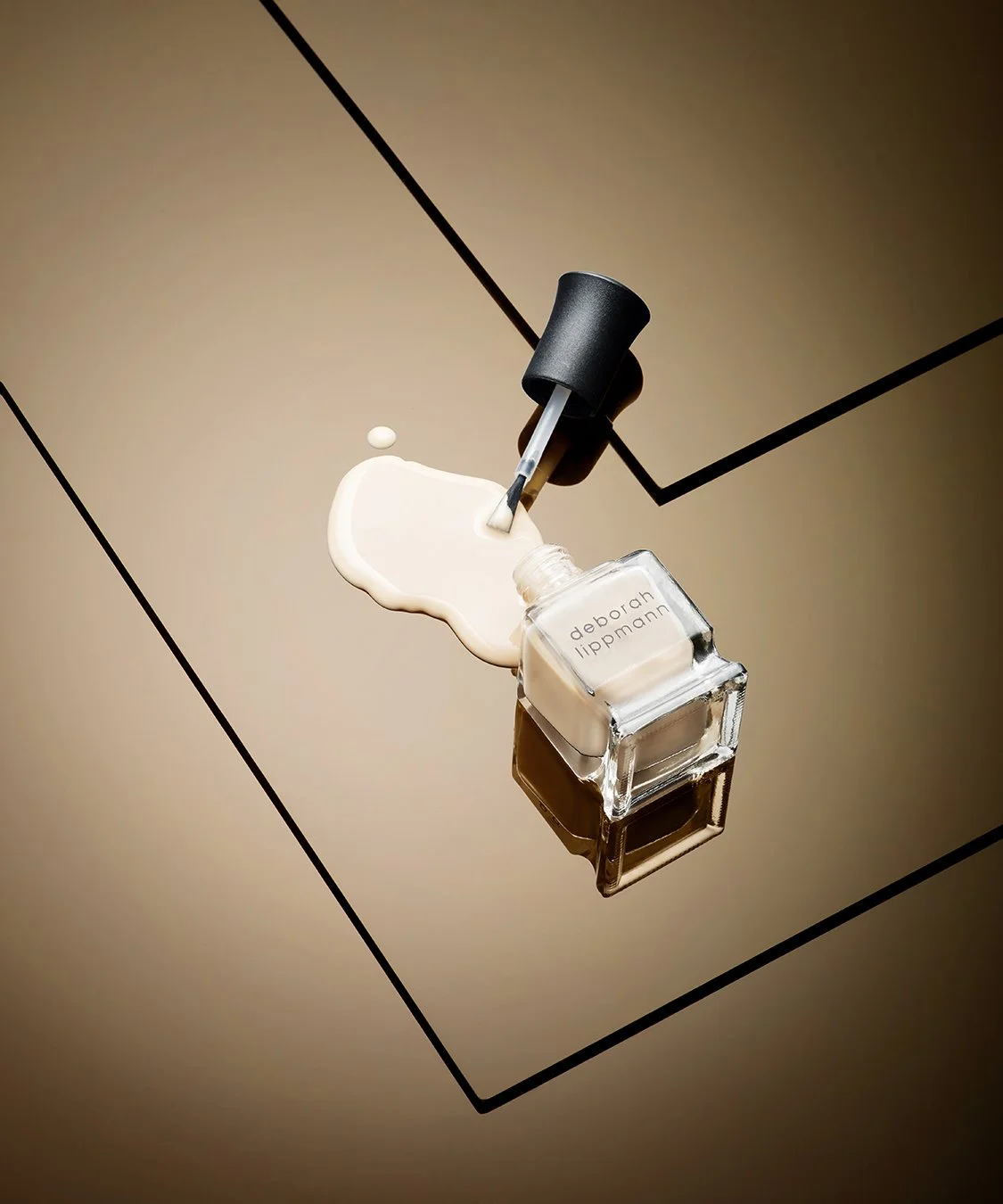
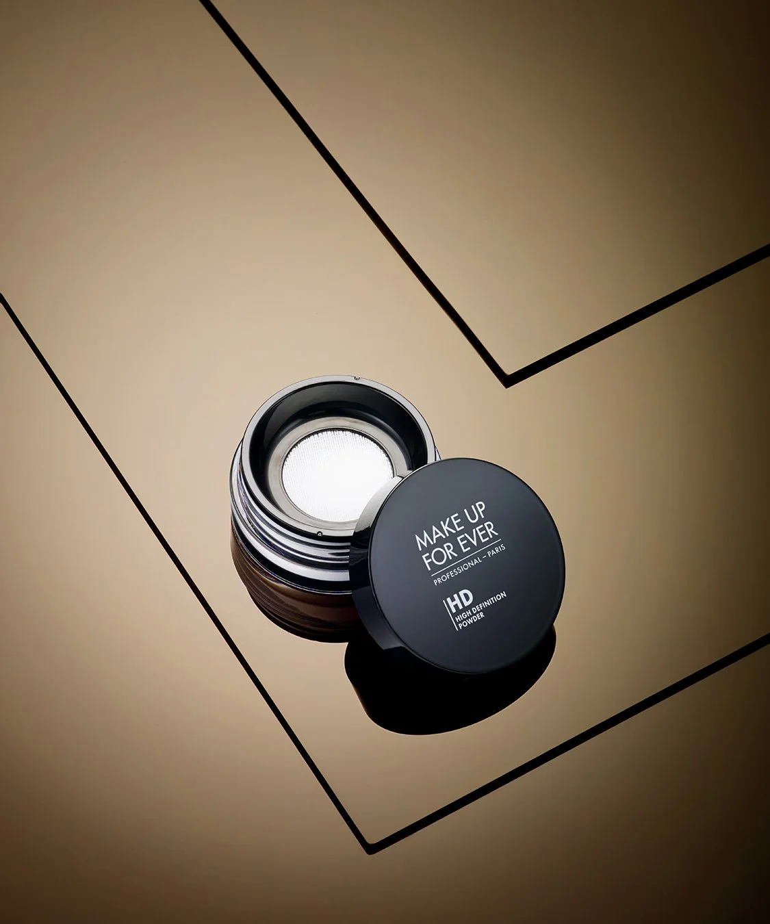
Brand and email campaigns · Photography direction